
Winter is surely starting to set in: I woke up to white this morning! While I doubt it'll last - this is Hamilton after all! - the cold wind is hard to ignore.
So while pulling out my winter sweaters the other day, I was thinking about colour themes for this season. Once again, grey seems to be the go-to neutral, which works for me! I love grey! All the classic colours of the season are out - navy, bright red, rich wine - so here's my "classics" palette for this year:
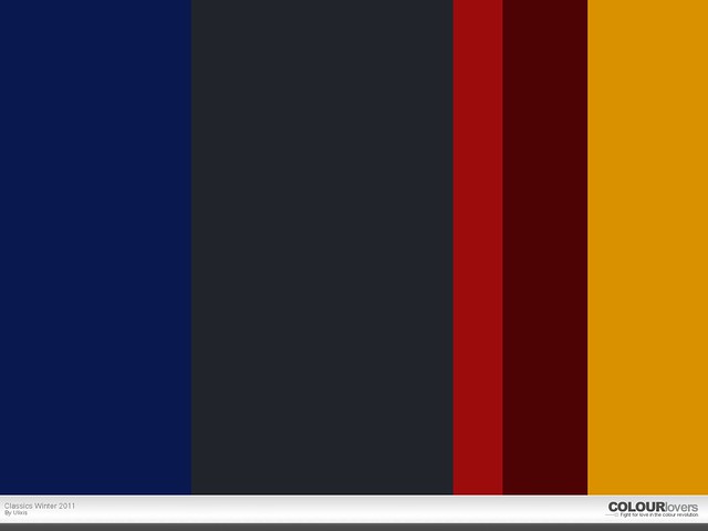
I chose a lovely charcoal grey & a jewel-toned navy. The cherry red looks almost pink next to the deep burgundy. I chose a shade that was close to cognac brown for extra versatility. Finally, I rounded out the palette with a warm gold. I wish I could make the colour more metallic, but you get the idea.
As you can see, I was playing around with the site COLOURlovers, where I make these palettes, & figured out how to adjust the width of each column. So I made the grey the widest because it's the colour that will get used the most. The bright red is smaller because it's more of an accent colour. The gold could probably be a bit smaller, more of an accent, but I was going for bold.
Now while those colours are pretty classic & will find a way into your style most days (& years), the next palette I created features some more trendy shades for this season:
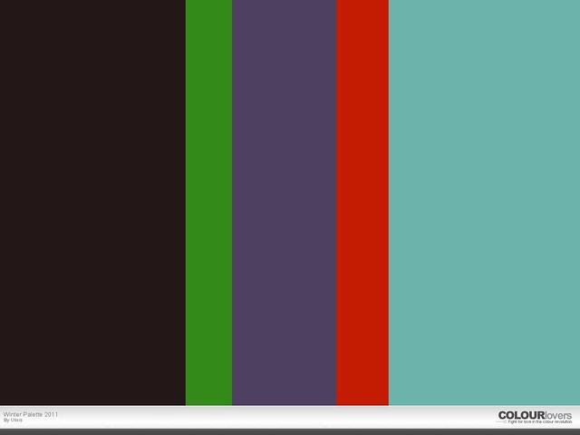
To set things off, I started with a dark, neutral base. It's a mysterious shade, grey and brown and dark enough to almost pass for black. Adding onto that solid start, I chose some bright, fun colours, like the cheery spearmint that's always welcome this time of year. Next I went for a dusky purple, a hue I've been spotting everywhere lately. It's a very nice shade, just as versatile as blue but a touch more feminine.
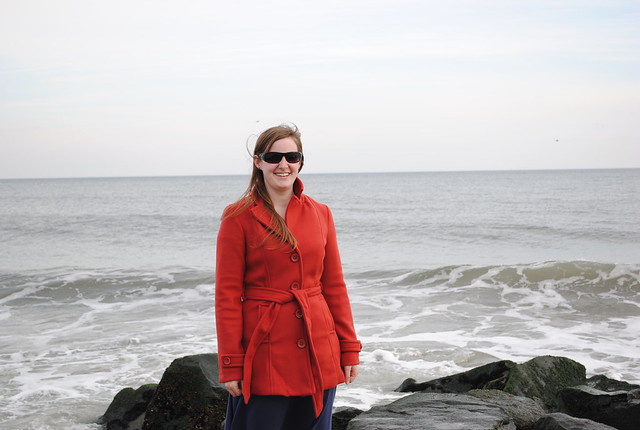
I couldn't stay away from the red family for a winter palette, but this year, look for more orange shades. This is probably my favourite colour of the season (though that purple is hard to beat!). Indeed, I found a gorgeous red-orange coat while I was in New Jersey (it's a bit more red than this picture would lead you to believe):
Lastly, I decided to add a pale turquoise to the palette, just to lighten things up a bit. Last year's dark teals are a bit fresher, lighter & closer to aqua this year. This colour combined with lots of white (& a bit of that spearmint or the purple) would make for lovely holiday decor! Just imagine a tree (a white tree!) decked in those shades!
I'll try to take some pictures of my wardrobe for this season. I also picked up 2 wool dresses while in New Jersey & I've been wearing them a lot. I've been gravitating towards tights & knee high socks (alone & together - in all sorts of bright colours & patterns), keeping my dresses & skirts in heavy rotation.
What colours & styles are you wearing this winter?
No comments:
Post a Comment