Showing posts with label palette. Show all posts

Tuesday, April 16, 2013

Spring Palette 2013

It's certainly starting to feel like spring around here! We've been alternating between rain for a few days, then bright, warm sun (with a sprinkling of freezing rain for good measure - it is still only April). I've been "preparing" for the season with my Spring Sampler cross-stitch and the Art of Spring workshop and have been thinking a lot about the colours that represent spring. I thought it was high time to get on my spring palette!

For 2013, the Pantone colour of the year is emerald, a very pretty blue-green teal. The other Pantone colours of the year include a juicy apple green, a luscious linen and zesty yellow. Here they all are in Patone's gorgeous graphic:


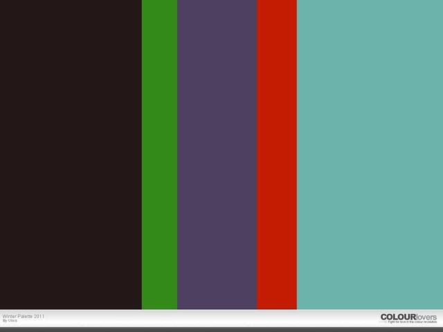
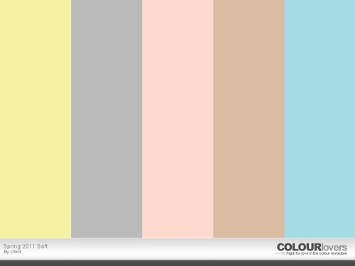
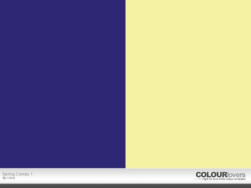
After browsing these and the trends on Colour Lovers, I decided to make two palettes for this spring - a pastel one and a bright one. There are just too many good colours to narrow it down more! I started with the pastels, including some linen, lilac and soft orange:
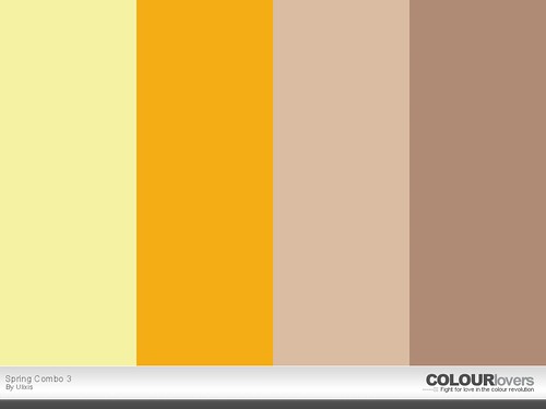
This might be one of my favourite palettes yet! The tones are so lovely and calming, even with the orange in there. Gray is still my go-to neutral; I just love it with everything! Although, I must say, that linen is a great neutral for the warmer months. I'll certainly be including it a lot of it in my summer wardrobe.

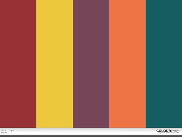
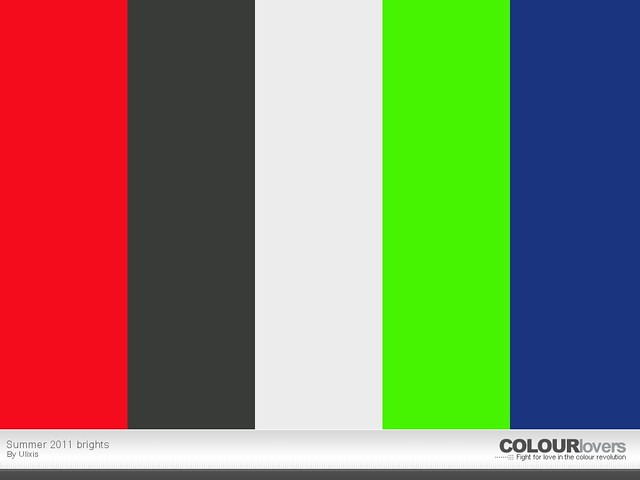
Next, I had to use some of the beautiful bright spring colours out there. I started with an emerald green but opted for a less blue version than Pantone. This green reminds me of a lush forest. I also chose a bright celery/chartreuse, a colour I've been loving this spring. It makes a great alternative to bright yellow.
You can see more of my seasonal palettes here.

What colours are you gravitating towards this season?

Monday, September 3, 2012

Fall Palette 2012

Everything is muted this season:
Olive green, oatmeal, dark navy blue, mustard and burgundy - all classic fall colours - are less bright than last year. Mix and match all of these colours, and include lots of cream and brown:
Oxblood leather - in a dark reddish-brown - and metallics are particularly trendy this autumn.

What colours are you wearing this season?

Tuesday, June 12, 2012

Summer 2012 Colour Palette

This summer is a rainbow of colour - from neon brights to soft pastels. Here's my summer palette that covers both bases:
Coral pink, juicy orange and cool mint are very trendy this summer. Try mixing and matching a couple shades - they all look great with black, white, denim or khaki.

Later this afternoon I'll post a few inspiring photos based on these summer colours!

What colours are you wearing this season?

Tuesday, February 21, 2012

Spring 2012 Colour Palettes

Spring certainly seems just around the corner with all the mild weather we've been having, so it was time to do a bit of research into colour trends for the new season. Personally I've been drawn to oranges lately - tangerine, peach, coral, tomato - and I've been pairing that with lots of grey, dusty purples & soft periwinkle. I've also been leaning towards pastels again, especially soft yellow, aqua & pinks.

It seems like Pantone agrees with me - tangerine tango is the top colour for spring 2012. Dusty, "natural" shades of olive, mustard, purple & tan round out brighter shades of pink, navy, teal & lilac. Other fashion sites agree - layered neutrals, pastels & muted tones with bright pops of orange, coral & green top the charts this season. Graphic black & white with bold accessories remains popular as well.

Anyway, on to the good stuff. Here are my colour palettes for spring 2012.

First, the pastels:
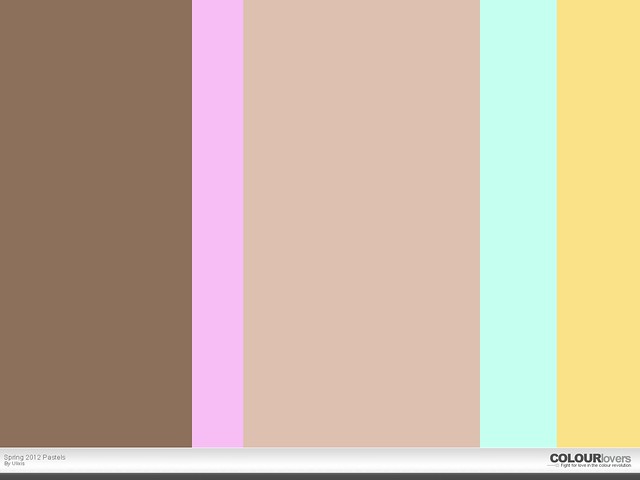
Fawn & oatmeal are my favourite neutrals & I paired them with a sassy orchid, a surprisingly versatile mint green & a soft butter yellow. If your pastels are muted, they can practically substitute for your spring neutrals. Don't feel like you need to stick to tans & browns for your darker shades either - dusty hues of grey, blue, purple & olive are all very trendy right now & look great in sheer layers.
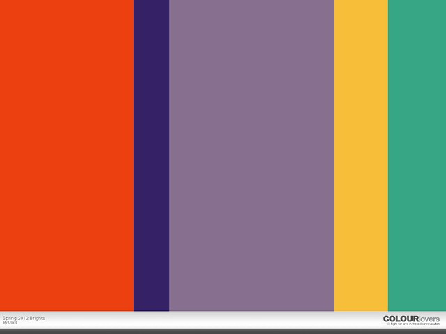
For my brighter spring palette, I went with my favourite shades of orange & purple, pairing them with a deep indigo, playful gold & seafoam green. A nice bright teal would have been great too. Use these brights to add some interest to your otherwise neutral ensemble. Don't be shy to mix one or two bright shades!

What colours are you wearing & using in your home decor this spring?

Friday, December 9, 2011

Winter 2011 Palette

Winter is surely starting to set in: I woke up to white this morning! While I doubt it'll last - this is Hamilton after all! - the cold wind is hard to ignore.

So while pulling out my winter sweaters the other day, I was thinking about colour themes for this season. Once again, grey seems to be the go-to neutral, which works for me! I love grey! All the classic colours of the season are out - navy, bright red, rich wine - so here's my "classics" palette for this year:
I chose a lovely charcoal grey & a jewel-toned navy. The cherry red looks almost pink next to the deep burgundy. I chose a shade that was close to cognac brown for extra versatility. Finally, I rounded out the palette with a warm gold. I wish I could make the colour more metallic, but you get the idea.

As you can see, I was playing around with the site COLOURlovers, where I make these palettes, & figured out how to adjust the width of each column. So I made the grey the widest because it's the colour that will get used the most. The bright red is smaller because it's more of an accent colour. The gold could probably be a bit smaller, more of an accent, but I was going for bold.

Now while those colours are pretty classic & will find a way into your style most days (& years), the next palette I created features some more trendy shades for this season:
To set things off, I started with a dark, neutral base. It's a mysterious shade, grey and brown and dark enough to almost pass for black. Adding onto that solid start, I chose some bright, fun colours, like the cheery spearmint that's always welcome this time of year. Next I went for a dusky purple, a hue I've been spotting everywhere lately. It's a very nice shade, just as versatile as blue but a touch more feminine.

I couldn't stay away from the red family for a winter palette, but this year, look for more orange shades. This is probably my favourite colour of the season (though that purple is hard to beat!). Indeed, I found a gorgeous red-orange coat while I was in New Jersey (it's a bit more red than this picture would lead you to believe):

Lastly, I decided to add a pale turquoise to the palette, just to lighten things up a bit. Last year's dark teals are a bit fresher, lighter & closer to aqua this year. This colour combined with lots of white (& a bit of that spearmint or the purple) would make for lovely holiday decor! Just imagine a tree (a white tree!) decked in those shades!

I'll try to take some pictures of my wardrobe for this season. I also picked up 2 wool dresses while in New Jersey & I've been wearing them a lot. I've been gravitating towards tights & knee high socks (alone & together - in all sorts of bright colours & patterns), keeping my dresses & skirts in heavy rotation.

What colours & styles are you wearing this winter?

Tuesday, August 30, 2011

Fall 2011 Colour Palette

Can you smell it in the air?
Feel the chill breeze in the morning?
Have you noticed the sunset painting the sky at a slightly earlier hour?

It's true.

Fall is almost here.... there's no denying it!

I must say I'm actually pretty excited. Autumn is about changes, it's the transition from lush, vibrant summer to icy, slumbering winter. This year, for me, it's the transformation from graduate student to full-time employee, with all the hard work & excitement that comes in between.

Well..... at least I hope to find full-time employment before the end of winter!

There's just something about fall though that makes it a favourite season for a lot of people. The crunch of leaves underfoot & their wonderful earthy smell; the rich harvest of crisp, tart apples & grinning pumpkins; brand new pencils, erasers & notebooks... it's back-to-school time & back-to-the-routine time; time to nest & prepare for the winter.

Time to shake the wrinkles out of your fall clothes! Are you excited? I am! I have a whole drawer full of sweater just waiting to be worn!

To get you in the same mood I'm feeling, here are some hot colours for the season:


Fall Brights
warm brick, gold, deep lavender, sweet apricot & dusky teal


Autumn Neutrals
chocolate raspberry, creamy tan, burgundy brown, dusty navy & juicy olive

All of these colours pair really well together and with your basic black, white & grey standbys.

Burgundy, especially when it takes on more burnished tones, is my favourite fall neutral. I have a sweater or two in the colour & just scored some lovely cords that I'll be showing you in an upcoming post. I need some new winter shoes / boots, so I've been looking for something in the tawny-wine shades. I haven't found anything yet, but I did see some awesome gold flats that I really wanted to pick up, if only they had been a bit more comfortable....

All the fall colours are so tempting, don't you think? It's their versatility that lures me in - they go with anything! Trust me, try out a few combinations that you think you might not like. I bet you'll be pleasantly surprised!

What colour combos are you loving this fall?
Keep an eye out for an upcoming post revealing a few of my go-to autumn outfits!

Tuesday, May 31, 2011

Summer 2011 Colour Palette

This summer, I'm all about orange, camel & navy. Don't they look luscious together?

This combination just screams HEAT doesn't it? I love orange for that! Camel & soft, almost nude pinks were very trendy this spring & easily extend into the summer. They pair with all colours for an instantly classic look - just steer clear from shades that are similar to your skin tone or you'll look washed out. Whether you're hitting the beach or a late-night cocktail, navy is a perfect substitute for harsh black & just as slimming. It's also a very versatile neutral that will go a long way in your wardrobe.

Bright, neon colours are in this season - not just orange - but be careful not to go overboard. You don't want to look like a clown! Pair one bold shade with dark or light neutrals (and remember: black, brown & white aren't the only neutrals around; try navy, burgundy, grey or other deep shades).

Bright cherry red & lime green are perfect summer colours. They look great paired with charcoal (another great alternative to black), dark blue, camel & light, airy off-whites. Neon nail polish is a particularly fun way to incorporate some colour without breaking the bank.

What colours are you drawn to this summer?

Saturday, February 19, 2011

Spring 2011 Colour Palettes

It's almost that time of year again; the best, cheeriest, brightest time of year: spring. Recently it's been warmer, the sun shining brighter & the days have been getting noticeably longer. It's almost still light out at 6PM!

With spring comes a new wardrobe: t-shirts, skirts, shoes & light jackets. Our colour palettes also adjust with the changing seasons. In the fall, we lean toward the darks: black, navy, burgundy, brown. But the spring is all about the lights: pastels & vibrant shades spanning the entire rainbow.

As with past seasons, I've put together a couple of colour palettes for Spring 2011. This time, I've done a bit of research first, checking out some online trends before choosing my colours. I focused on versatility, infusing my own style & tastes into my collections.

Here is the soft palette:

And the bold palette:
As I mentioned, I wanted a versatile collection of hues that would combine well with each other. As a demonstration, here are a few combinations that I found particularly appealing:
This first combination is striking & chic. Pair a buttery blouse with a navy skirt or suit for an outfit that radiates confidence & class.
Honeysuckle, this bright pink, was rated the colour of the year by Pantone. I think it pairs nicely with the fawn shades that are so popular this season. I also liked how the two pinks play off each other.
Yellow & orange make another winning combination paired with nude. As you can see in the original palettes, blue is also a perfect partner for these lovely shades of tan. Stocking your wardrobe with a few key items - trousers, a blazer, shoes, a purse - in versatile neutrals can go a long way, combining to create a variety of different looks with seasonal brights.
Lastly, these cool tones would be perfect for a bathroom or kid's room, don't you think?

What's your favourite spring shade or colour combo?

Sunday, September 19, 2010

Autumn 2010 Colour Palettes

I picked up some make-up this weekend - nailpolish in pewter, eyeliner in olive - and got to thinking about fall colours. I recall making a fall colour palette before - it was something I wanted to put together seasonally, but promptly forgot about it. So why not start again now?

This fall, I'm obsessed with grey. It has always been my favourite neutral & is a huge part of my wardrobe. Which is why I gravitated towards this gorgeous shade of polish by Sally Hansen, called black platinum.

It's dark, but has a great blue iridescent tint. I'm not a fan of doing my finger nails (as opposed to my toes), but I do love this:
And my shirt is just another example of the grey in my wardrobe. This is my newest shirt - one I picked up at the Roger Waters concert I went to last week (don't mind the track pants & bed hair).
I always regretted not picking up a Neil Young one when we went to his concert, so I had to grab one this time.
Of course I went with the gray one. It was definitely the coolest one. Obviously.

Anyway, back to the palettes. Let's start with the grays. Here are some of my favourite shades - with hints of teal & brown:
Grey can be a little washed out & casts a dull hue on brighter shades. Personally, I think this faded look is perfect for fall, but greys can pack a punch too. Here's a similar grey palette, with slightly bolder shades:

Not bad - I particularly like that sage. But enough with the greys. The following is my official Autumn 2010 colour palette:

I chose to keep the teal and steel shades of grey as I think they complement the olive, berry wine & dusty camel quite nicely. So these are your must-have colours this fall! Feel free to mix & match - grey is so versatile it looks great with anything!

What's your favourite hue this fall?

Thursday, August 7, 2008

Fall 2008 Colour Palettes

I had some colours bouncing around in my head and they needed to be let out... in an orderly manner, of course. I've already spoken about the site COLOURlovers, and so I headed right there tonight when I couldn't stop thinking: burgundy is the colour this fall. So when I saw a few items on Etsy pairing gray and burgundy, I knew I had to make a palette.

And why not a Fall 2008 palette? These are colours that I think are (or at least should be) going to be hot this fall. When I got to the site and started choosing colours... I just had to make two different palettes. One bold, above and one cool, below.
When I first thought of which colours to include, I knew I would pair the burgundy with hot pink as well as the gray. Hot pink is playing a large part in my current wardrobe, so it was a must. I love burnt orange and mustard yellow for the fall, but didn't have the room for both if I wanted to include a juicy brown. And I think brown is still going to be trendy this season... I chose a saucy colour with orange undertones.

As for the second palette, I've always been a big fan of olive green, turquoise, violet and gray. So that was the inspiration. And starting out, I thought of winter, and snow, so the pale pink reflect that and cools off the other colours.

The way the site works has you moving around sliders to choose the colour you want (unless you know the hex value... and if you do... nerd!). This give the whole process a creative edge, letting you play around with it until you get the perfect match. And so in my search for the perfect olive, I found a leafy green. Turquoise yielded teal and a periwinkle actually gave me that gorgeous indigo. I'm quite pleased with how they both turned out. Now only buy things in these colours this fall, ok?