Thursday, February 28, 2013

My Creative Space: She Background #4

I took a few in-process shots of my fourth She Art 3 background - I just put the finishing touches on it yesterday.

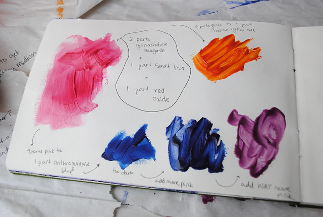
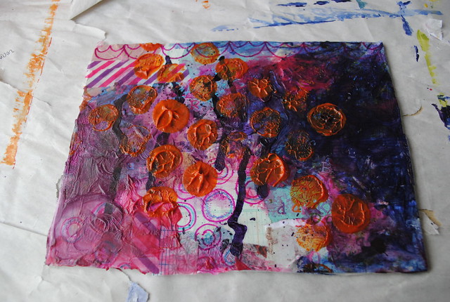
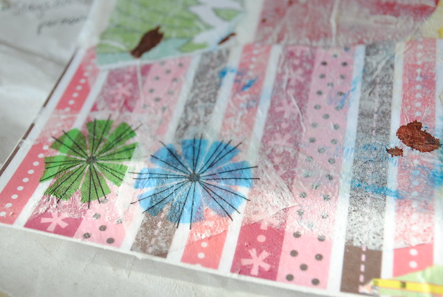
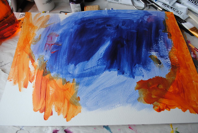
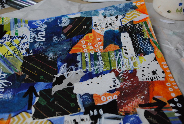
I started out with this 10"x14" piece of watercolour paper where I had laid down leftover paint from my second background (tiny bit of pink [quinacridone magenta + smalt hue + red oxide], orange [pink + Indian yellow hue], blue [various amounts of pink + anthraquinone blue]):
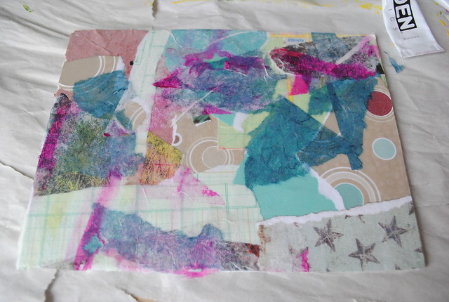
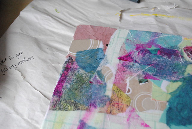
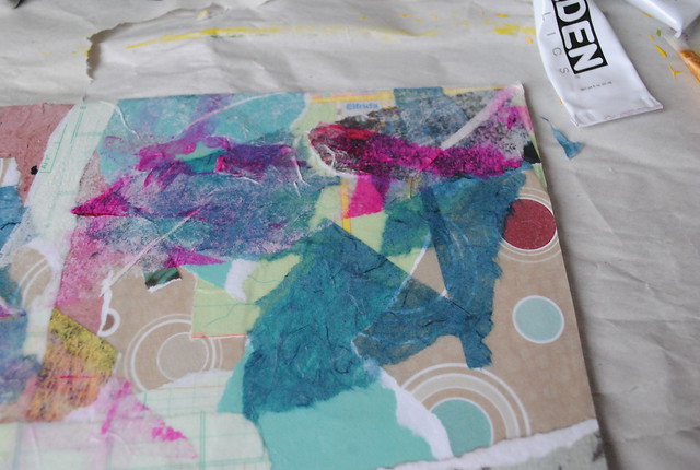
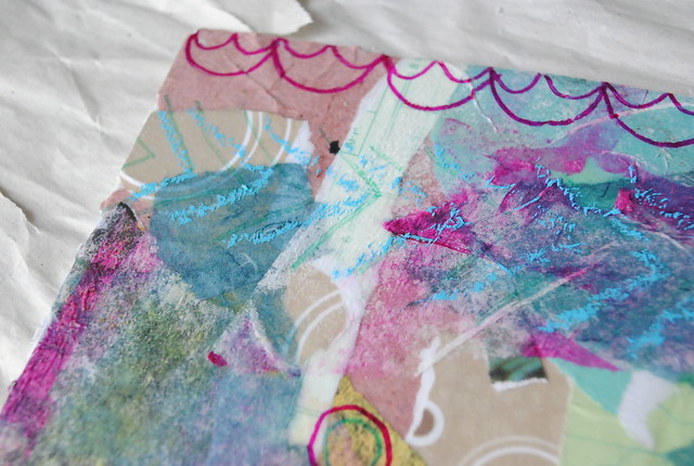
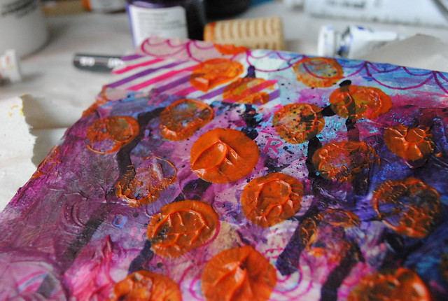
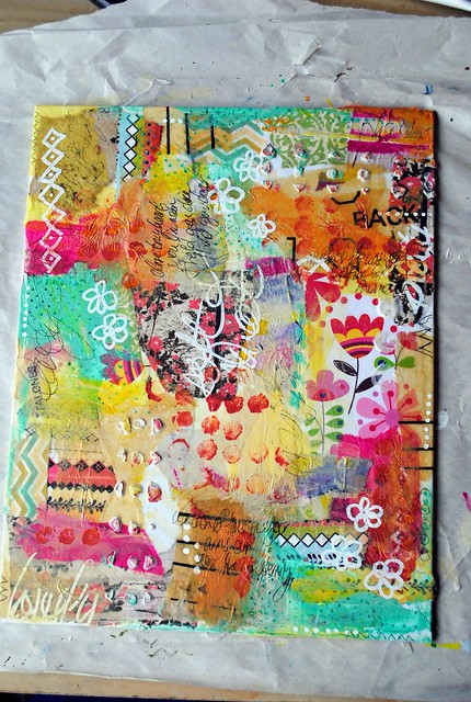
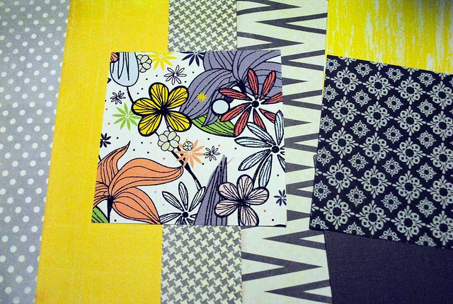
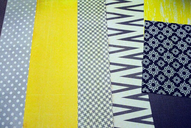
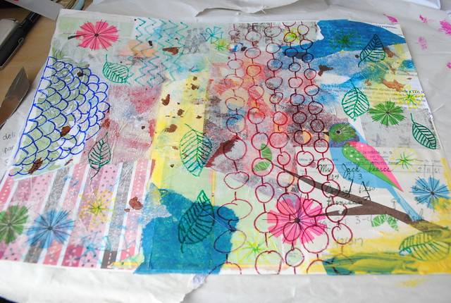
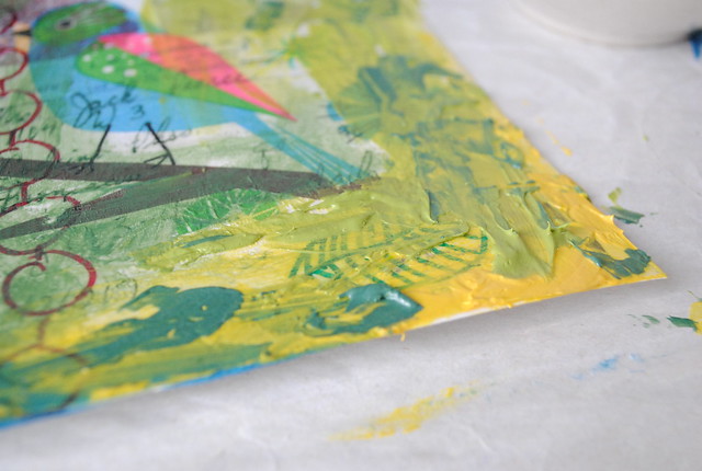
It's a bit unbalanced, but the complementary colours are bold and bright - so I decided to use them with contrasting black and white in my collage on top. I used scrapbook, calendar, handmade and tissue papers.

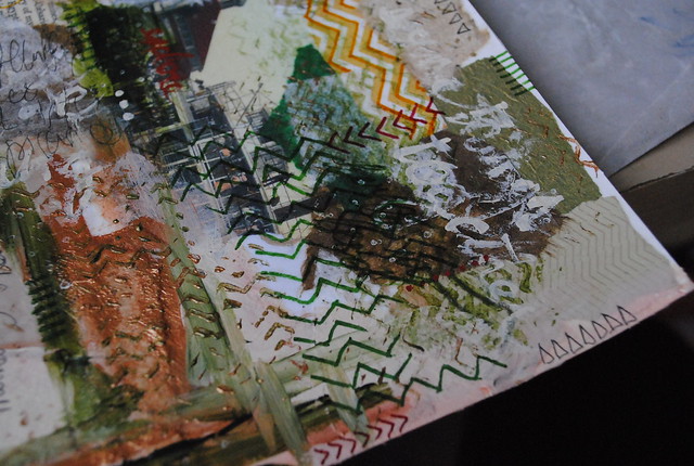
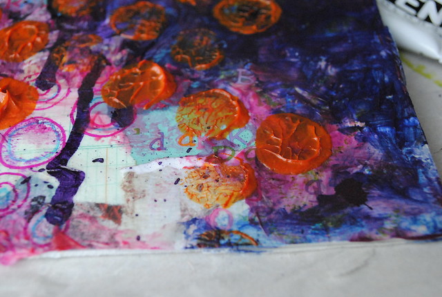
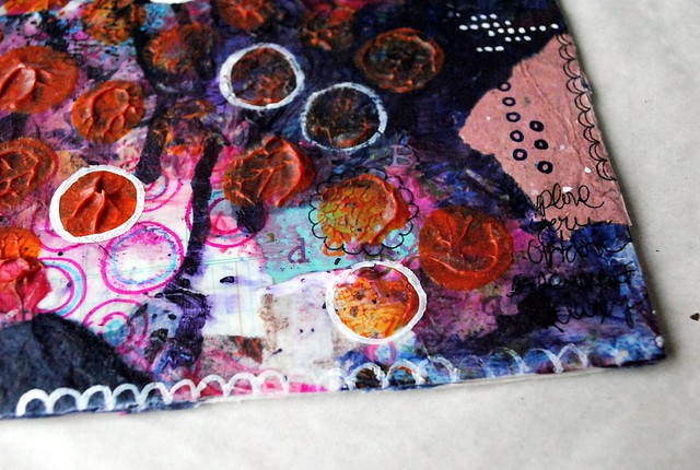
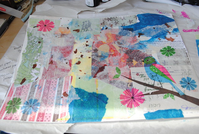
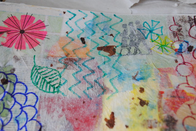
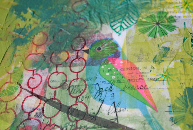
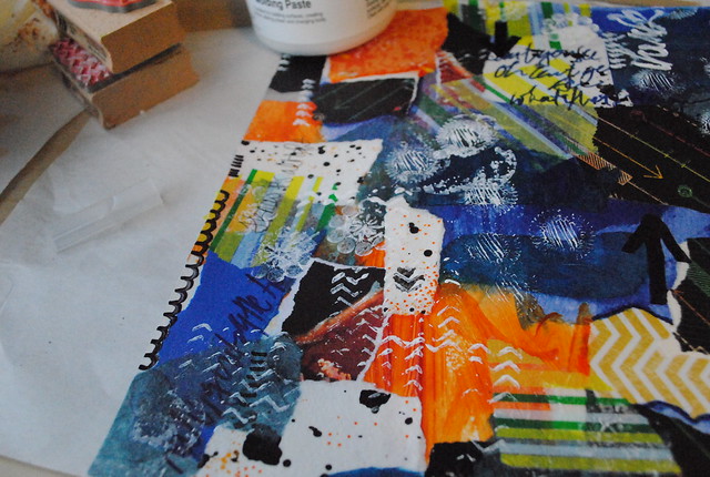
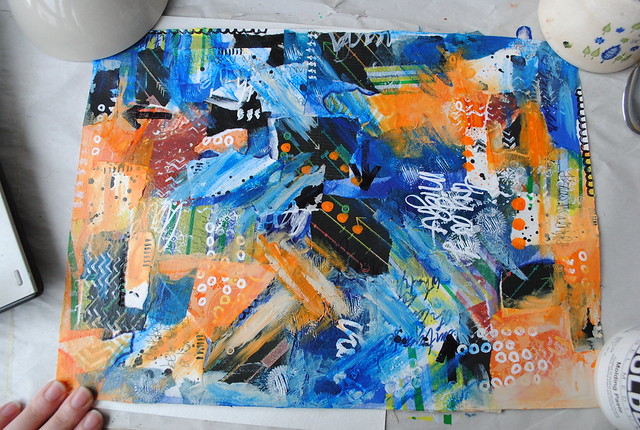
I then went ahead and doodled with black Sharpies, Faber-Castell Pitt pens (orange and indanthrene blue) and white paint (using a few stamps here and there) before taking photos:

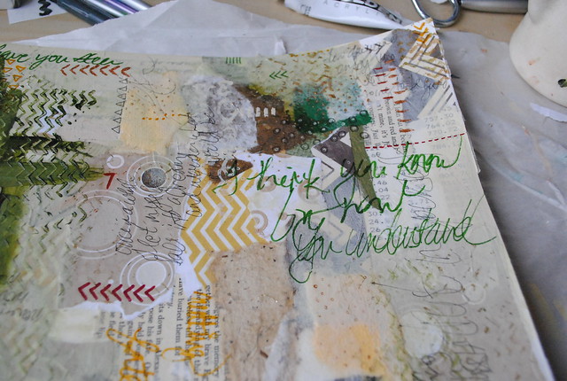
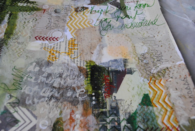
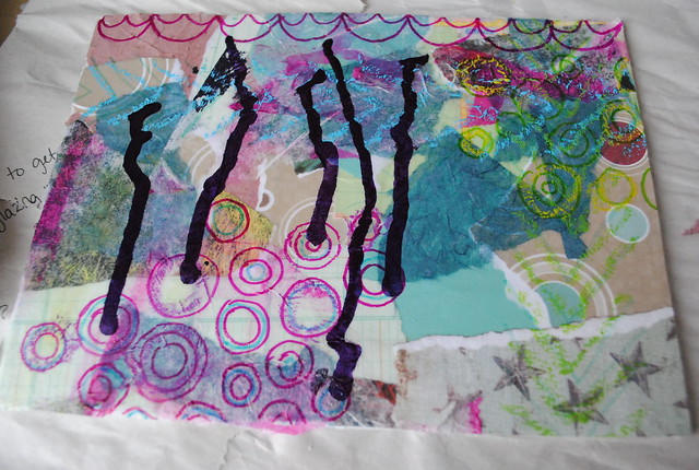
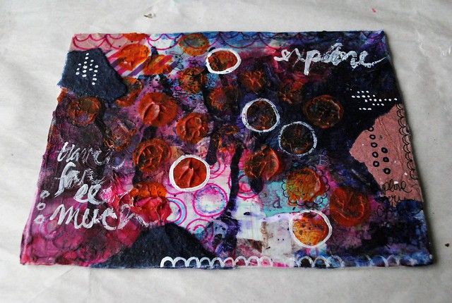
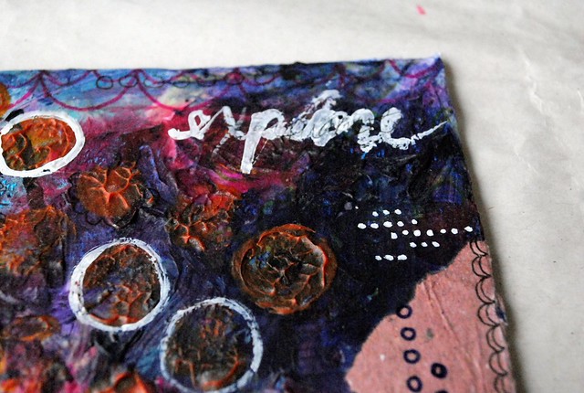
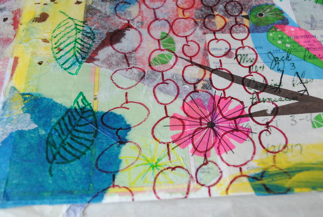
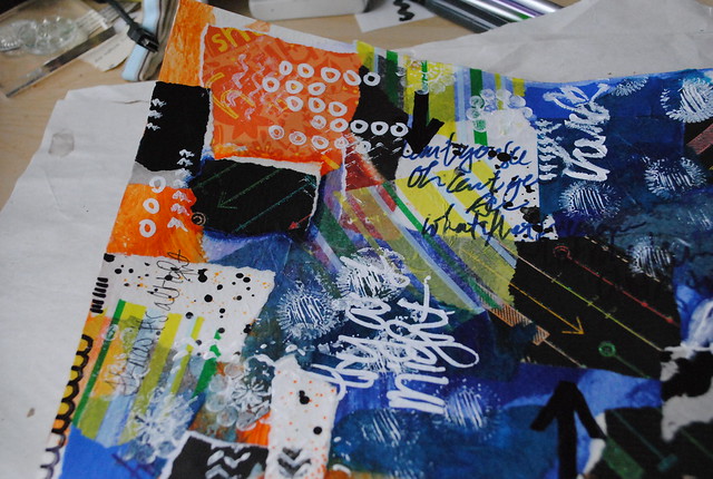
I felt the piece needed some white still, so I used my new Sharpie to add a few words and doodles:

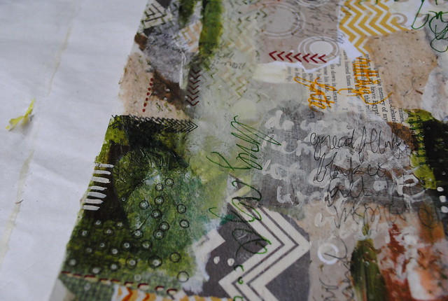
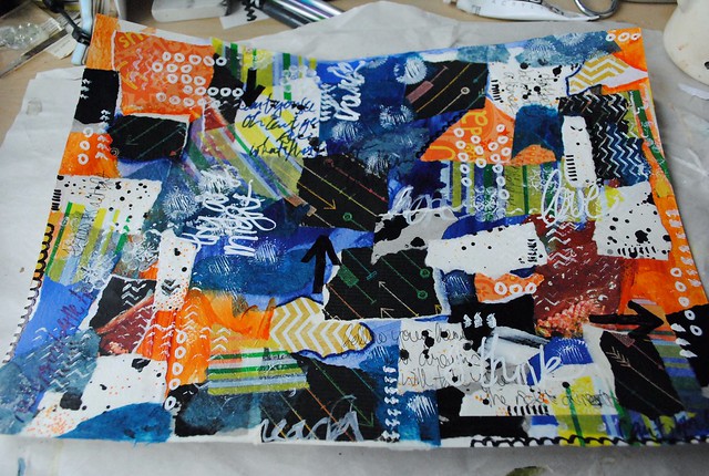
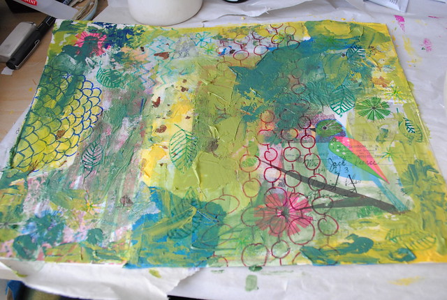
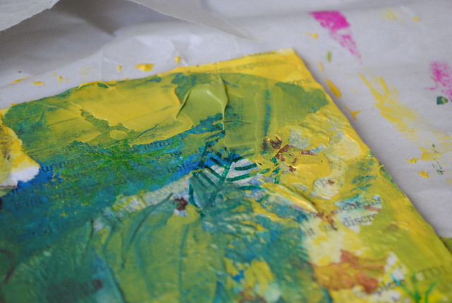
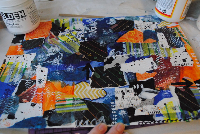
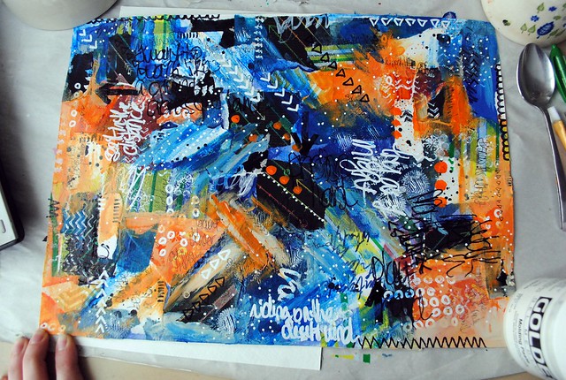
It still felt unfinished though, so I finally added a layer of paint (phthalo blue, azo orange and titan buff):
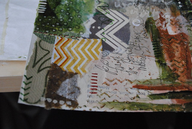
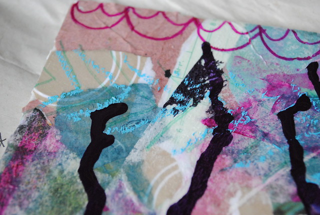
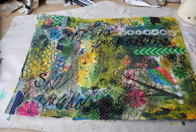
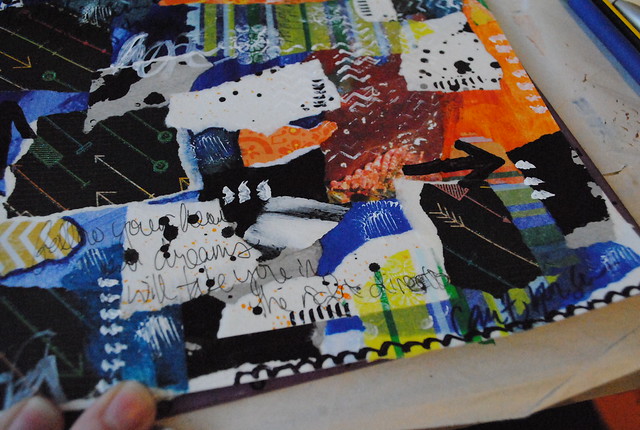
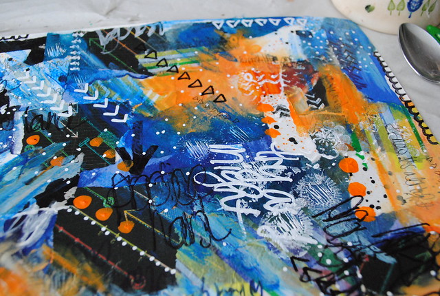
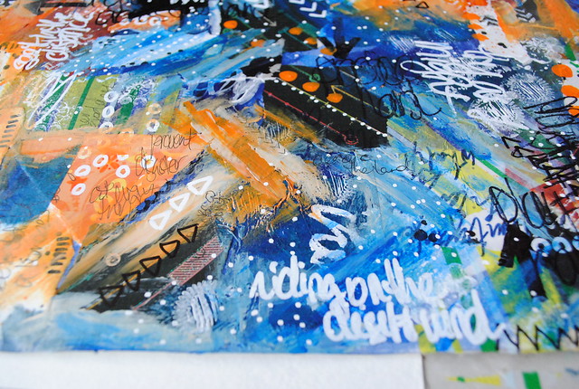
Of course, then I had to finish it off with a few more doodles using white and black Sharpies. I went a little crazy with white dots... but I like it.

You can find all my She Art blog posts here and more photos in my Flickr folder here.

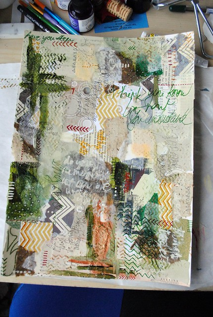
More creatives spaces. 

Wednesday, February 27, 2013

She Background #3

My third background is one of my favourites so far. The neutral colour palette turned out just right - I can already see a girl in there. I just went for this one - no in-process photos - but I do have a few close-ups.
Layers (in order): collage (scrapbook, vintage, tissue, handmade papers, postcard and book text); paint (sap green, titan buff, iridescent copper light and red oxide); painted details and words; doodles and words (Sharpies in olive green, gold, maroon and black) 

Tuesday, February 26, 2013

She Background #2

Here's a closer look at the second background I worked on for Christy Tomlinson's She Art 3 workshop.

I started with a collage using various papers (map, scrapbook, ledger, calendar, packaging, handmade and tissue papers). I originally thought I'd go more muted, so I added some white tissue paper on top to sort of tone things down.

Next I added some details with Sharpies and dripped some purple India ink. I also added washi tape and rub-on letters, but I failed to capture a picture of that before moving on to the next layer.

The next layer was paint. Here's my colour palette:
I started with the pink (2 parts quinacridone magenta, 1 part smalt hue, 1 part red oxide) then took a bit of it and added a dark blue (athraquinone blue) to get purple. The blue was entirely too dark though, so I successively added more pink until I got a very pretty purple. I wanted to try something a bit different, so I decided to go the other way with the remaining pink by adding a bit of yellow for a coral pink. I added a bit too much Indian yellow hue though and got this magnificent orange... I wasn't convinced it would be a nice addition to my canvas, but this is all about experimentation so on it went. I added a pattern of dots using a wine cork:
I ended up really loving the palette... until it dried a bit darker than I would have liked. There are pros and cons to working with glazes and more transparent paints. This is a con - the orange just isn't as bright on dark purple as it is on white paper. After watching a few more She Art videos, I decided the canvas lacked balance, so I added a few more collage elements before doodling some texture on top.
I added white and black details using paint and a fine Sharpie, respectively. Now that I have a white Sharpie, I think I'm going to add a bit more white for contrast. It's a bit dark but when I turned it so that the darker purple is at the bottom edge, portrait-style, I can almost see a girl on there. A very pale girl.

What would you do with this background to finish it?

Monday, February 25, 2013

She Backgrounds: Update

Here's a quick look at where I'm at with my She Art backgrounds. I have five in some state of completion - two on canvas board, three on watercolour paper:
My first "canvas" on 10"x14" watercolour paper. I'm still not sure if it's exactly finished... I think it needs a bit more white. Now that I have a white Sharpie (thanks to a Curry's run this weekend), I may add a bit of doodling to brighten it up; there are a few areas that are a bit muddy for my liking.

My second piece, on 6"x8" canvas board. Again, I feel this needs more white. Also, the circles are too big for the small canvas... but I hate to cover them because they're so fun. Not too sure where to go with this one anyway...

Another piece on 10"x14" watercolour paper - and my favourite one. I went with a more muted palette and really love how it turned out. I can already see a girl placed on here.

My third piece on 10"x14" watercolour paper - I went with a bold colour scheme for this one. There's a lot of contrast and it definitely feels unfinished. Since the bottom layer was just a splash of bright colour, I think another layer of paint on top will go a long way.

Lastly, my absolute favourite on 8"x10" canvas board. I started with a more muted palette here as well, but the pops of pink, yellow and turquoise really brightened it up. I didn't intend on adding the turquoise actually, it was a happy mistake that I'll get into in another post. For now - the layers on this one are just perfect! Although it may be able to handle a tiny bit more black... maybe a splatter of India ink?

Anyway, that's it for now. More on each, with photos of various stages of my process, later this week. This blog is going to be all She Art for the next two or three weeks - that's all I'm working on and breathing right now! It's been so much fun and very inspiring! Week 2 is released tomorrow, so I'll soon be adding girls to these backgrounds - I can't wait!

Sunday, February 24, 2013

Sunday Seven

Here's what I'm grateful for this last week:

Sunday: attending an edge-of-your-seat hockey game
Monday: traveling back late to make the most of a long weekend
Tuesday: taking the day off - on the very day the She Art 3 workshop started
Wednesday: getting back into exploring with paint
Thursday: Pat's help around the house
Friday: hanging out with friends
Saturday: having a clean apartment so that I can paint all day, guilt-free

What are you thankful for this week? 

Friday, February 22, 2013

Paper Coordinates: Sun Beam

I love, love, love this colour combo (yellow and grey). The floral paper was a bit of a surprise - I didn't mean to add other colours, but it just fit so well.

Thursday, February 21, 2013

My Creative Space: She Background #1

If you haven't noticed, I'm really enjoying Christy Tomlinson's She Art 3 class. In fact, it's all I've been doing over here (besides reading of course)! Along with sketching, I've started working on backgrounds this week.

For my first one, I chose to start with a sheet of watercolour paper instead of canvas since I'm not planning on selling it. The paper is cheaper and bigger than any canvases I have (or will be picking up soon). I also used a very similar process to what I usually do - Christy only challenged us to go a step further than we normally would: experiment and have fun.

So that's what I did. I'll need to add another layer or two if I want to take it a bit further than I normally would though!
I started with a layer of collage. I used various papers including scrapbooking paper, text, tissue paper, painted tissue paper, napkins and vintage papers.

Next I doodled a bit with some Sharpies. I tend to forget about doodling with pens when I'm painting but I'm so glad I did. I love the effect and the added texture.

Lastly, I added a layer of paint using both brushes and a palette knife. I mixed the yellow first (soft gel medium + titan buff + hansa yellow medium + Indian yellow hue), then using the leftover yellow I added some blue (smalt hue + cerulean blue deep) to make a pale green. Then using the leftover green I added more blue (cerulean blue deep + ultramarine blue) to get teal. In this way, I can be sure that the three hues I mix will complement each other nicely.

Next, I think I need to break out my inks and stamps and add some more details. And probably some more doodling and maybe a bit more collage. And maybe I'll try adding some oil pastels in there too, though I don't have water soluble ones, so that might be interesting. It's all about experimenting though, right?

You can find more creative spaces here.