Friday, March 22, 2013

I love you Pumpa

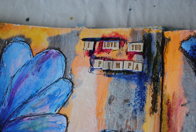
I don't really have the words right now. I'm still in shock and denial. Yesterday was the one year anniversary of my grandpa's death. Today, I lost my remaining grandfather. My Pumpa.

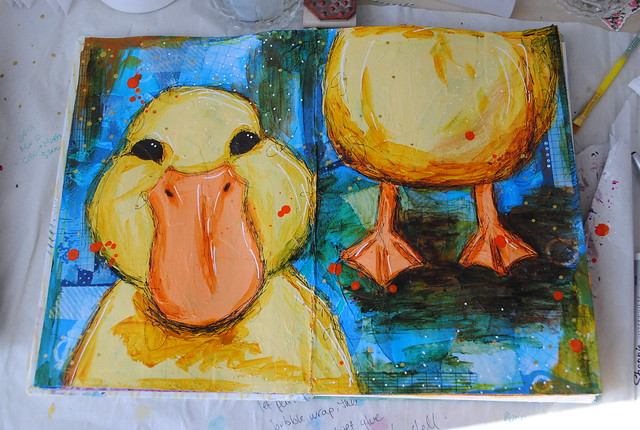
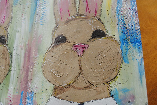
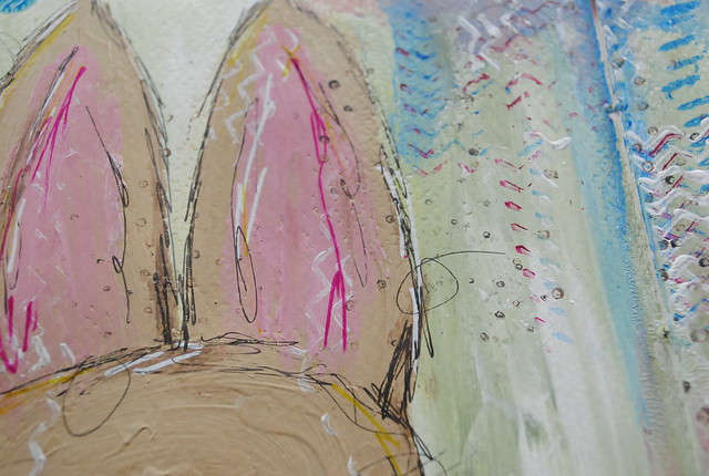
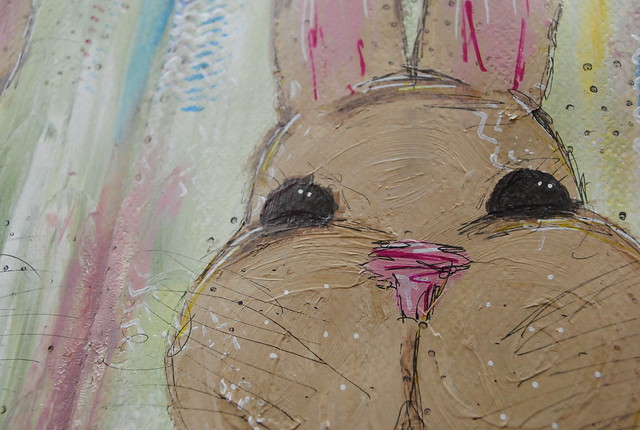
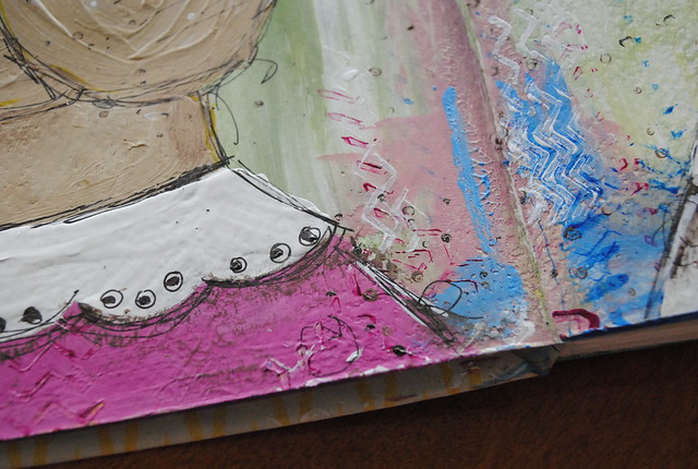
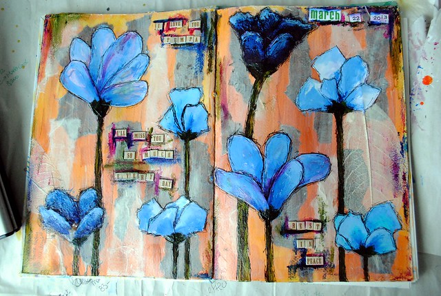
Last night, I was trying to decide where to go with this bright orange background in my Art of Spring journal. Today, I knew I had to dedicate it to Pumpa. I didn't follow any of the workshop tutorials for this (I haven't watched the one on blooms yet); I just let the page take me where it needed to go. Where I needed to go.
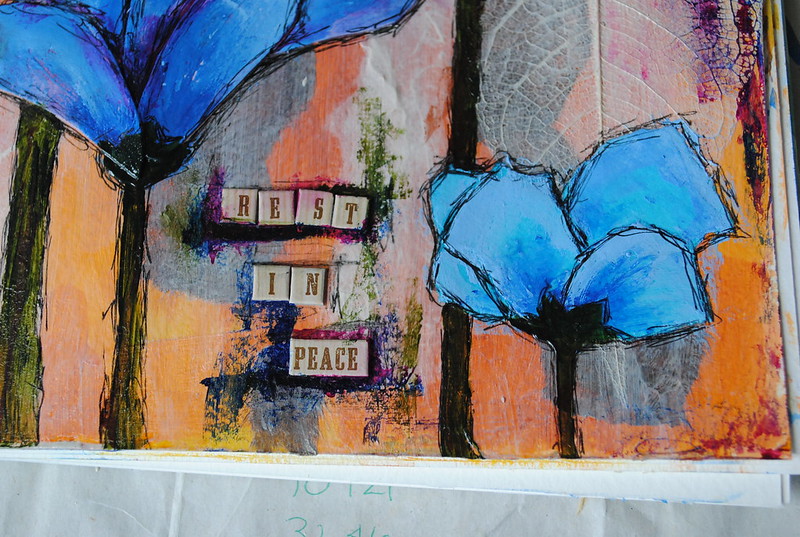
Rest in peace Pumpa. Say hi to Grandpa and Grandma Giesler for me.

A heartwarming note: yesterday was World Down's Syndrome Day. My grandparents' first child, Laurie Anne, had DS and passed away from leukemia just after her first birthday. It's a small comfort to know that she's in her daddy's arms now.

Layers / my process:

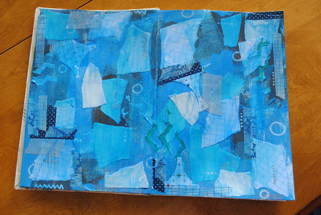
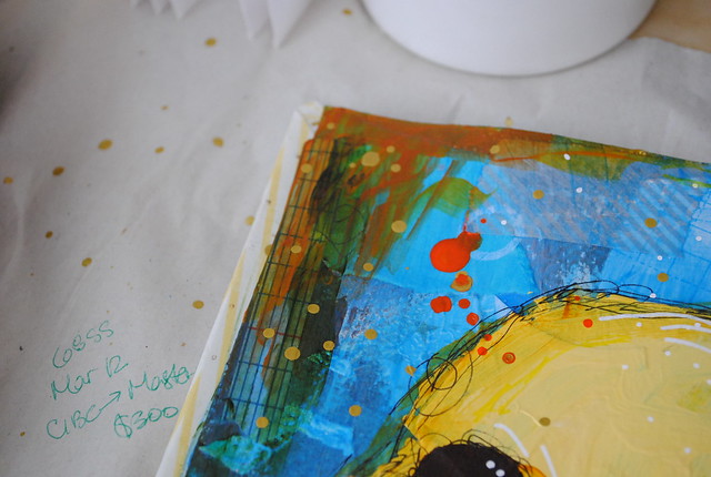
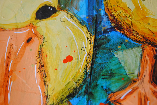
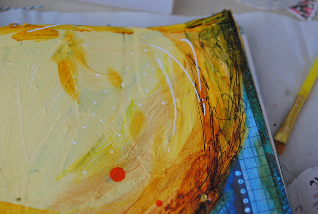
1. A simple, bright orange background using leftover paint from the previous spread (gesso, azo orange, Indian yellow hue, raw sienna).
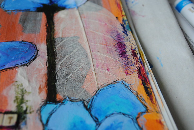
2. I felt like it needed a bit of toning down once I knew the subject, so I added some strips of handmade and tissue papers (brown and white), one and a half skeleton leaves that had been embedded in the white paper and an off-white glaze (titan buff, glazing medium).
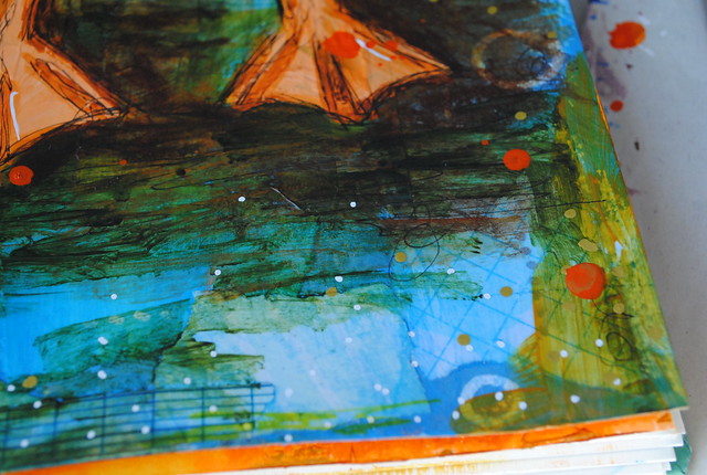
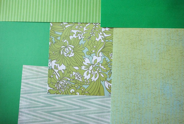
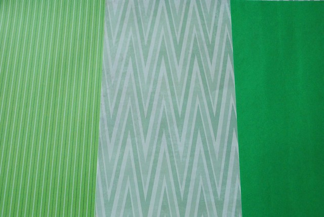
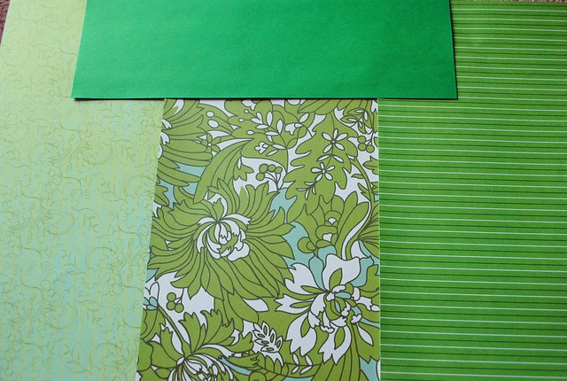
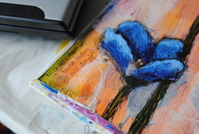
3. Collaged flowers using cut and torn scrapbook and watercolour papers in shades of blue (the watercolours were from the initial workshop videos).
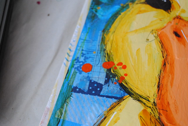
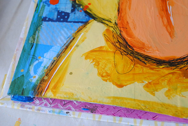
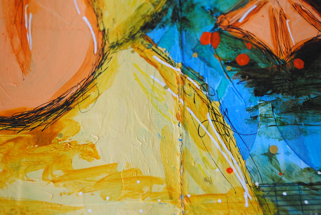
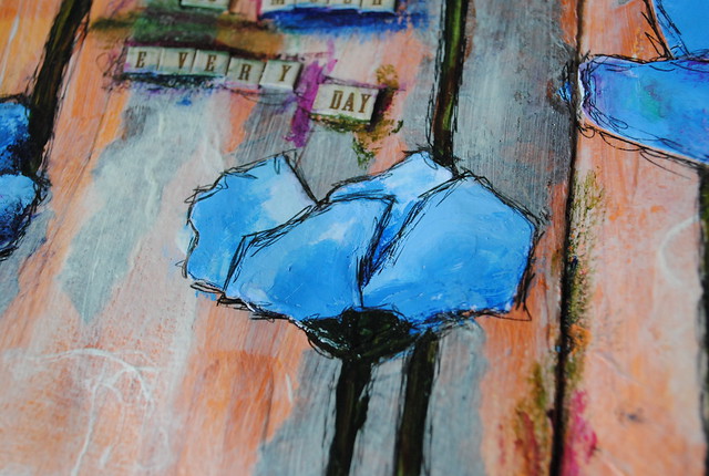
4. Painted the flowers in different shades of blue (smalt hue, anthraquinone blue, gesso), then added the stems (sap green, brown India ink).
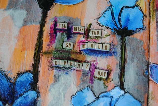
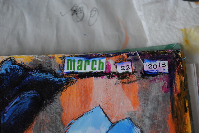
5. Alphabet and word stickers (K & Company), plus the date I cut from a small calendar were collaged next.
6. A bit more paint to tie everything together (anthraquinone blue, sap green, permanent red violet).
7. Doodle, doodle, doodle (Sharpie pen).
8. I found a small feather among my papers and felt it appropriate to add. It belonged to my finch, Michael, who's been gone over a year now. 

The Art of Spring: Ducklings

The first spread in my Art of Spring journal was very pastel and sweet - this second spread is equally sweet, but quite a bit more vibrant. I love how it progressed and the final result is just as I imagined!

I started out with a bit of a mess. As is typical for me, I just slopped leftover paint from my first spread onto these pages. It was mostly bright phthalo blue and a bit of dark brown (burnt umber light) but it didn't look pretty. I was tempted to stick to just paint again for the background (as Junelle Jacobsen, the instructor, does) but collage is my thing. I love collage. So I gathered some blue bits of scrapbooking and tissue papers and went to town. Then I added some washi tape and doodling (white and silver Sharpies) for good measure. It was looking a little rough still, so I covered it all with a transparent blue wash (phthalo blue, cerulean blue deep and glazing medium).

Finally, I was getting somewhere. The blue was bright and glossy - a perfectly watery background for a duckling or two!
Next I sketched out the ducklings. Can you see them above? I used a blue watercolour pencil, so there's just a hint of them in the photo.

HUGE TIP: sketch using a watercolour pencil instead of a regular pencil when sketching on a painted surface. Not only does it erase completely without smudging, but if you use a colour similar to your background, you won't see it through your paint, no matter how transparent.

All that was left to do now was to paint the ducklings! I used a soft yellow (hansa yellow medium, Indian yellow hue, raw sienna and gesso) and orange (azo orange, gesso) then I added some detailing with darker shades (Indian yellow hue, raw sienna, burnt sienna, azo orange, burnt umber light, sap green) before finishing it with a messy doodle (Sharpie pen). I realized at this point that I hadn't added any texture with stamps, so I decided to do that with Sharpies instead (white, gold, yellow) and a splatter of orange India ink.  The result was slightly messy and oh-so cute!
So so SO happy with this page - it makes me smile big!

Thursday, March 21, 2013

My Creative Space: Woodland Sampler

Since the kit came in, I've been stitching away at The Frosted Pumpkin's 2013 monthly woodland sampler. I didn't order the supplies until the beginning of this month, and I'm really kicking myself I didn't do it sooner!

So far I've started on a few frames (we receive all the frames in advance, then each month we get the corresponding "filler") and I just completed the March square last night. Isn't the little smiling amanita adorable?
Now what are the odds I'll be able to catch up before I receive the April design? A bigger question: what are the chances I'll catch up before I receive the kit for The Spring Sampler? That's right, I signed up for the spring sampler too - that starts in (and is on-going throughout) April and I can't wait for all the spring-y goodness!

On another note... I need to figure out what to do with this floss. Especially since I'll be working on this all year - plus I'll be getting a similarly sized bunch for the spring sampler and I don't want to mix them up. Or have them get all tangled. Any suggestions?

More creative spaces here. 

Wednesday, March 20, 2013

(Nearly) Wordless Wednesday

First off - happy first day of spring! It snowed here yesterday... ugh. Bring on the sun!

When Pat and I were both off last Tuesday, I convinced him to hang a few pictures on the wall. Nothing fancy, just a few of the pieces I got at IKEA when I moved into my first apartment many years ago. I wanted a pop of orange at the entrance and the blue/silver went well in our main washroom.
Now if only we could find the hardware to hang a couple of mirrors before I try to find spots for the rest of my art and framed photos...

Tuesday, March 19, 2013

Spring Doodling

I don't think I've ever been more excited for spring.

I'm sure it has everything to do with the spring workshop I'm taking (and I'm very much tempted to sign up for this spring cross-stitch sampler) but I really just can't get enough of all things spring!

As a result, I've been doodling like mad in my sketchbooks:
This last one is less sketch, more finished page. I started with the border, then added the grasses, bunny and tree (all with pen, I typically don't sketch with a pencil first). It wasn't too interesting in black and white though - it needed some colour. Gorgeous, pastel, spring colours (I used watercolour pencils without water).

Now I need to work in my Art of Spring sketchbook! Those ducklings are all ready to be painted in on a lovely blue background.

What are you favourite spring things?

Monday, March 18, 2013

The Art of Spring: Bunnies

The first Art of Spring project was bunnies. If you've followed my blog for a while now, you know I LOVE bunnies. I couldn't wait to get started!

I showed you some of my sketches last week - here's the finished spread in my art journal:
Bonjour Mr. et Mme. Lapin!
Junelle Jacobsen, the instructor for this workshop, has a style that's a bit "messier" than mine. I really like the effect though, so I tried to add more sketchy elements that I normally would. Similarly, I started with a very simple painted background and added the texture afterwards with leftover paint. It ended up being a little calmer and more spring than a really busy background would have been.

I love love LOVE this spread - I can't wait to see my whole Art of Spring art journal fill up! Next up: ducklings!

Supplies used: Golden paints (burnt umber light, raw sienna, mars black, Indian yellow hue, hansa yellow medium, sap green, titan buff, cerulean blue deep), Venetian acrylic gesso, Amsterdam paint (permanent red violet), Rock paint (phthalo blue), stamps (chevron, circles), Sharpies (black pen, yellow and magenta fine point) 

Sunrise

I have a ton of photos to take of my latest Art of Spring page (bunnies!) but while my camera's battery charges, I thought I'd share these sunrise photos I snapped this morning.
The CN tower looked huge against the orange backdrop!

Catching a sunrise has been a fairly rare occurrence for me, especially in Hamilton where we didn't catch much sun in our North-facing apartment. Here, our bedroom faces Southeast, so we often wake up to bright light streaming onto our faces. This morning I happened to wake around 7 and saw the most gorgeous oranges and pinks. Unfortunately my phone barely captured the true beauty I was privy to.

I hope your morning is off to as beautiful a start as mine! 

Sunday, March 17, 2013

Happy St. Patrick's Day!

Paint the town (or your nails) green!
I couldn't decide between the turquoise or the grey... grey and green is one of my favourite combinations right now.
From left to right:
Zoya professional lacquer - Evvie
Avon nailwear pro+ nail enamel - Garden Green
Nabi magnetic nail polish - Tierra
Avon nailwear pro nail enamel - Electric Green
Avon nailwear pro+ nail enamel - Absinthe
Sally Hansen intra-dri fast dry nail color - Turquoise (no official colour name)

Sunday Seven

Here's what I'm grateful for this last week:

Sunday: visiting and supporting family after a great loss
Monday: a nice tribute for an incredible woman
Tuesday: having a day off with Pat to unwind after traveling
Wednesday: getting supplies to start the monthly 2013 woodland sampler cross-stitch
Thursday: watching the new Big Bang with Pat
Friday: spending the afternoon in clinic, meeting doctors, patients and taking blood under supervision (only three more before I'm certified!)
Saturday: hot wings, Scotch and UFC

What are you thankful for this week?