Saturday, April 25, 2015

Curtains

Here's a small glimpse into our new home - and a first decision: curtains! Based on the size of our front window, we thought it would be easiest to go with curtains. Since I like a lot of light but I still want to protect our hardwood, we decided to go with two layers: sheer ones with UV protection and dark ones for the evening. Here are the sheer ones:
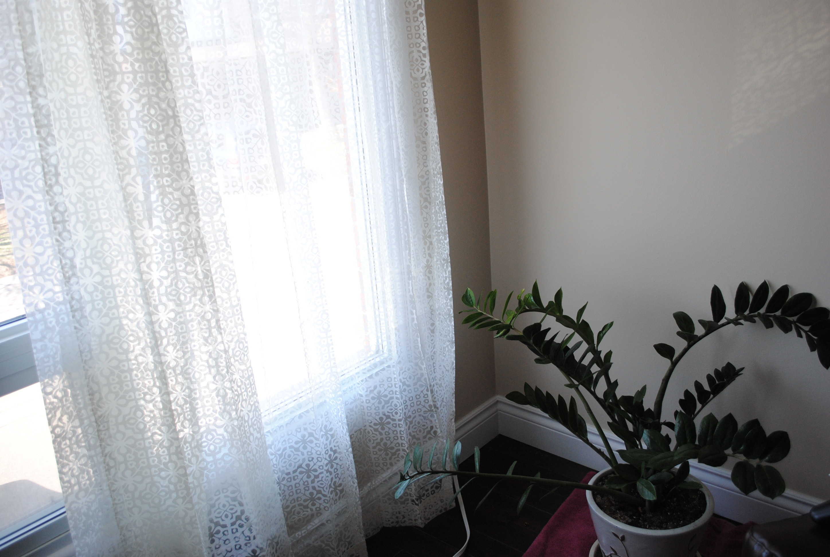
I love the pattern on them - they're perfect.

Here are the curtains we're trying out (only bought one panel to see if we liked them):
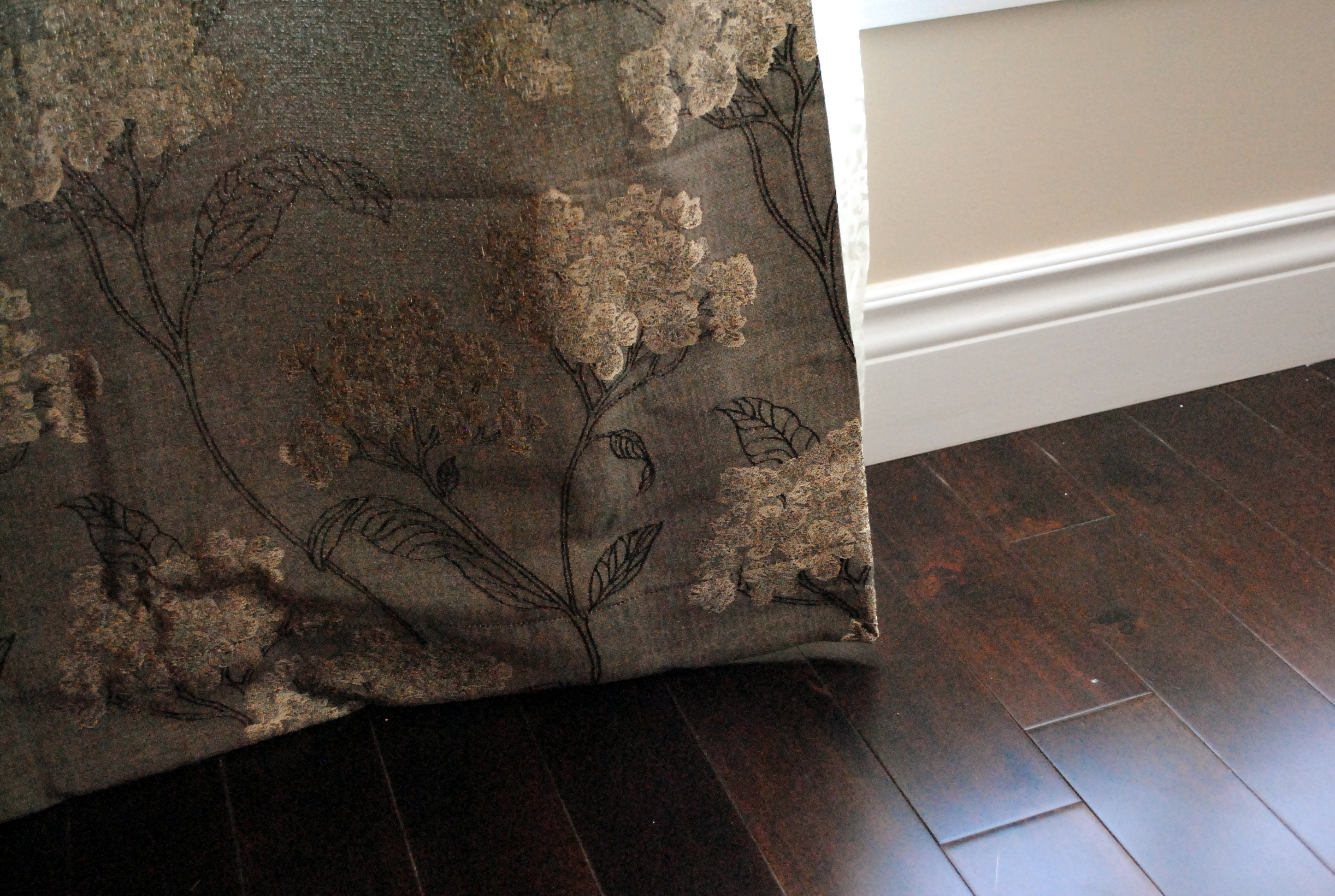
They're a lovely neutral grey-brown with shimmery gold flowers and dark brown leafy outlines. I love them - I think they suit us and the space well. Pat doesn't really like them.. he doesn't think the colours match the room. So we're still looking for now. We also need curtains for our master bedroom and blinds for the other two rooms and the dining room at the back.

Things are slowly coming together - there's still so much to do though! And this weekend is totally dedicated to the apartment: emptying the last few items remaining, cleaning and painting. Fun stuff! 

Tuesday, April 14, 2015

Collections: Royal Doulton Dolls

I'm waiting for Pat to return with the van we've rented so that we can start moving... so I decided to share a few quick photos I took of my Royal Doulton dolls. This is one of my most precious collections. I've shared each one as I got them and they all hold a special significance for me. Here they all are, lined up and ready to be packed up and moved to their new home:
From left to right, shortest to tallest, they are: Amanda, Goody Two Shoes, Laurianne, Victoria, Autumn Breezes and The Last Waltz.

OK, Pat's back - time to move!

Monday, April 13, 2015

Sketchbook Pages: Reflections

Last week, I figured I could get in one more altered book page before I needed to pack up all my supplies (today's our closing day!) - and after that hot pink page, I wanted some cooler tones. So after reinforcing the pages with a bit of masking tape, I took out my turquoise Liquitex paint marker and dabbed it onto the page. Then I mixed a few blues (using sky blue light, permanent blue violet, phthalo blue and phthalo green) and applied then with a dry brayer:
This effect immediately made me think of water, so I collaged a few elements to go along with that theme: patterns reminiscent of riverbed stones and a wooden dock. I then covered the page with splashes of gel medium (that eventually dried transparent) to give it a wave-like texture:
My next step was to add a few more layers of paint - sky blue light and permanent blue violet - in order to help the collaged elements blend in a bit and to bring out the texture:
At this stage, I was really happy with the effect I had created. But it wasn't done, so I went on to add my next typical layer: doodles with Sharpie pens (white and silver in this case). That was a mistake. It didn't give me the look I wanted - it was too much, way too busy. So I decided to give it a wash with glazing medium mixed with a small amount of gesso to calm things down a bit. I should have stopped there and waited for things to dry; I think I would have been happy with the turnout. But while it was still wet, I didn't like it, so I added some more gesso in the form of clouds.
I left it at that, heartbroken I had ruined my beautiful page. When I came back to it the next day, it wasn't so bad. I knew I could salvage it, but it needed a few more clouds for balance. The last step was a bit more Sharpie doodles (outlining the clouds in blue and a few more white circles) - subtle ones, just to harmonize the page.
Moral of the story: sometimes it's best to take a step away from the page, let things dry, before rushing on to the next layer. And if you don't like it, push forward - something good will come.

Sunday, April 5, 2015

Sketchbook Pages: Love More

I've gotten my groove back! I'm well on my way to crossing off my longstanding goal of filling up this Amber altered book. Here's my latest page:
Since this is an old novel, the pages are quite thin and fragile. Over the course of working in it, some of the pages have torn - as was the case with one of the pages for this spread. So, to start, I covered a good part of both sides with masking tape before painting. I mixed gesso with naphthol red medium and a bit of azo orange for a pretty sunrise effect.

Since I'm back in the mixed-media groove, I'm rediscovering some of my favourite supplies. In this case, I took out some of my stamps and added in a few layers of arrows and chevron in black ink.

The page sat in this state for about a week before I had a chance to get back to it. I decided to add to the stamped areas: I journalled messily with a black Sharpie and doodled with black, orange, pink and red oil pastels. Without stopping for photos, I collaged in a few small pieces of patterned paper that just happened to be the perfect shade of pinky-red. Then I pushed everything back with another layer of orange and red paint:
To finish the page, I felt it needed a bit more doodling. This time, I started out with a white Sharpie and drew in a flower. Then I added a few more with a red Prismacolor. I added flowers and circles with a gold Sharpie before finishing off with a few "love" phrases in the red. Lastly, I felt this page needed a bit of splatter - seems I can't finish a page without it! Droplets of black India ink and white gesso just tie everything together so nicely! 
This page makes me especially happy because I used a few techniques and supplies I haven't used very often lately. I have Easter Monday off and I hope to get one last page in before packing all my things away. One more week before our big move! I'm SO excited!