I'm not one to complain about winter. In fact, I actually prefer winter over summer (assuming winter stays around -20°C or warmer and summer is hovering around 30°C or higher... layers trump sweat any day!). I'll take too cold over too hot any time of year! And truthfully, this winter hasn't been that bad compared to some (just worse than the last few years, which really did spoil us)... but still, I really am,
truly, ready for spring.
There's just something
magical about spring, no? The budding trees, the early blooms, the fresh, warm air, the birds chirping, the green, everywhere... it's just so refreshing. So renewing. A fresh start, even better than the one the new year affords.
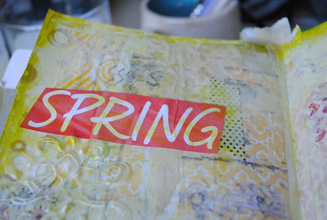
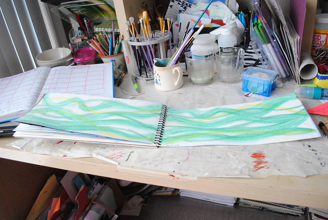
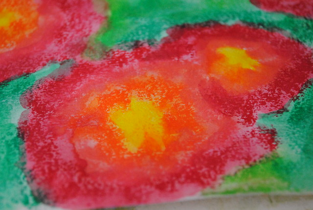
I guess that's where my creative spirit was resting when I was working on this page over this past long weekend. Even though it wasn't planned and I wasn't really thinking "spring", nothing else seemed to work when it came to the finishing steps...
But let's start at the beginning, shall we?
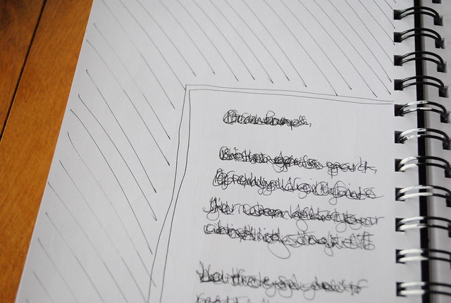
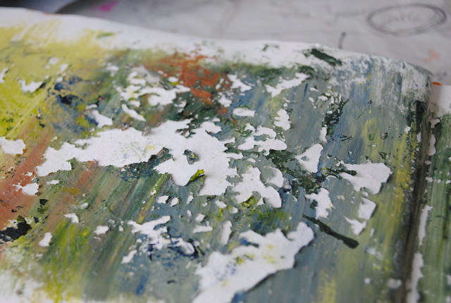
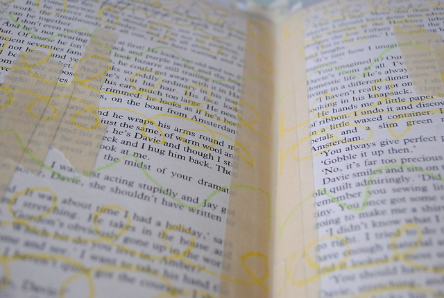
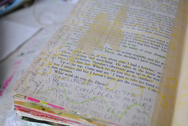
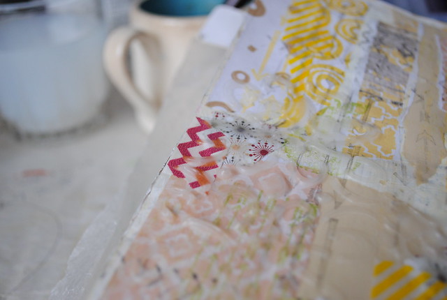
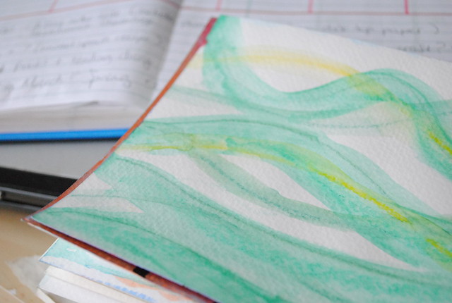
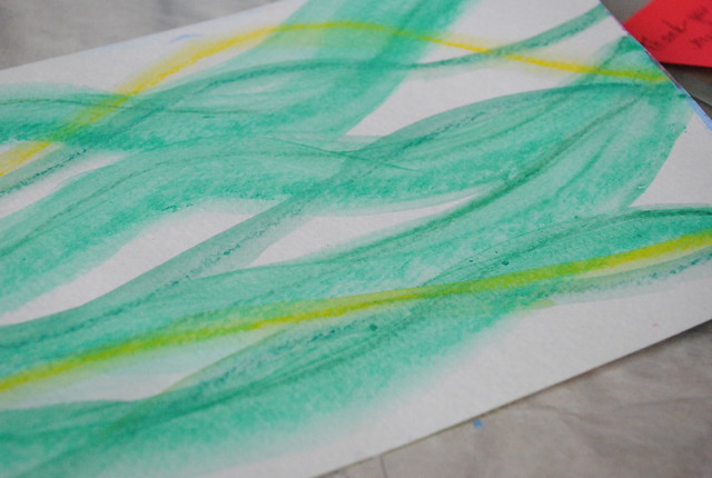
After taping the spine (with masking tape), I felt the page needed some journaling before I started. So I wrote in all the margins with regular pen. Then I added some more masking tape, and finally doodled a bit with Neocolor II watercolour crayons for added texture. It's all about the layers for me! Finally, some gesso to even it all out before starting my favourite part:
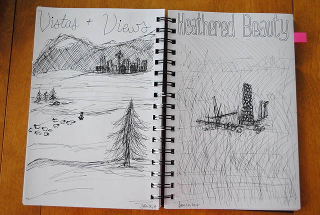
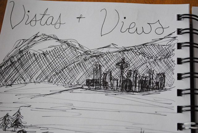
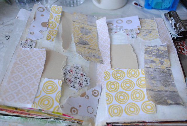
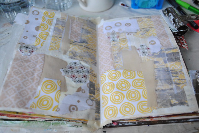
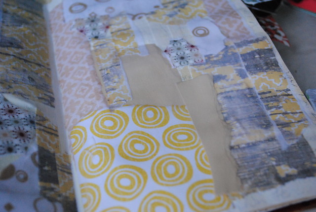
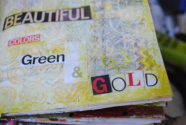
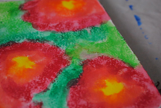
Collage. You can see here how my initial "visualization" in the first photo differs from the end product. Mostly, the placement part is less complete than the finished piece - once everything is glued down, there are always gaps (be it in colour or patterns/placement) that need filling.
For this page, I knew I wanted to go with some yellow, so I started there. Of course, the first paper I pulled from my "yellows" folder was the neutral solid. Then the patterned brown and the "pop of colour" pattern featuring dark green and burgundy (plus the circles, brown-on-white, inside-an-envelope, recycled paper). THEN came the yellows. I was so happy with how everything fit together!
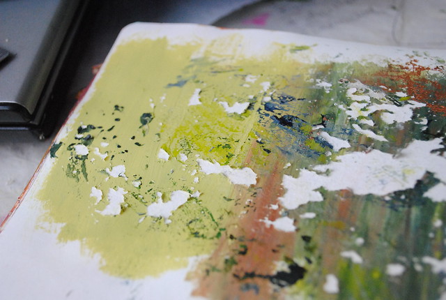
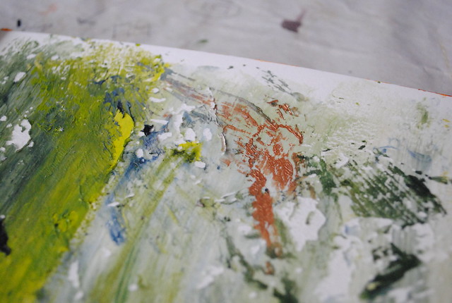
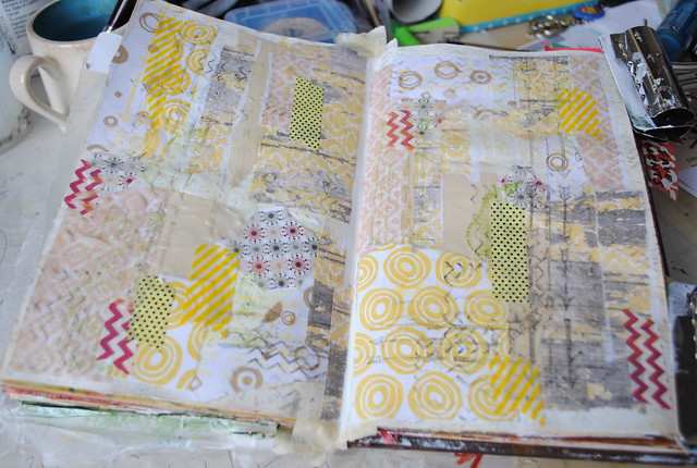
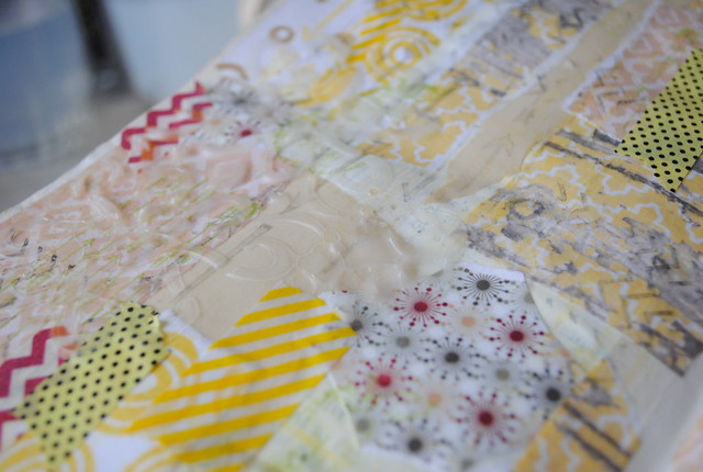
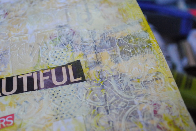
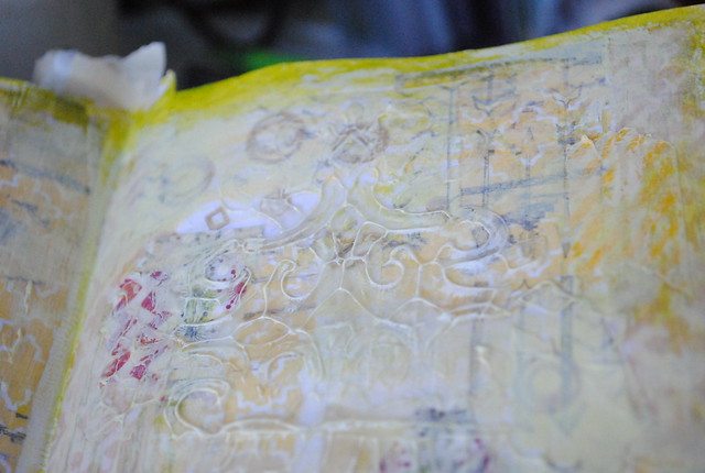
My next few layers added to the texture and depth of the background. First, since it had been a very long time since I'd used them, I pulled out my stamps and inks and put those to use (mostly arrows and chevron in green, yellow and dark grey). Then a touch of washi tape (again, following my theme, using yellows and a bit of burgundy chevron) before adding a thick layer of gel medium through a stencil for extra tangible texture. You can see that the cheap maroon chevron tape bled a bit to brown... I can't say I was disappointed. I love the added interest (plus it isn't at all noticeable in the finished piece)!
Once the gel medium was completely dry (you can tell because it goes from white to transparent), I went for some paint. I actually pulled out all my greens and yellows, but only used one colour: olive green light by Amsterdam acrylics (plus a bit of gesso). I used it straight from the bottle to darken the edges of my pages, then I mixed it with gesso to highlight the raised bits of gel medium (and then I double-highlighted with straight gesso because I really wanted that texture to pop).
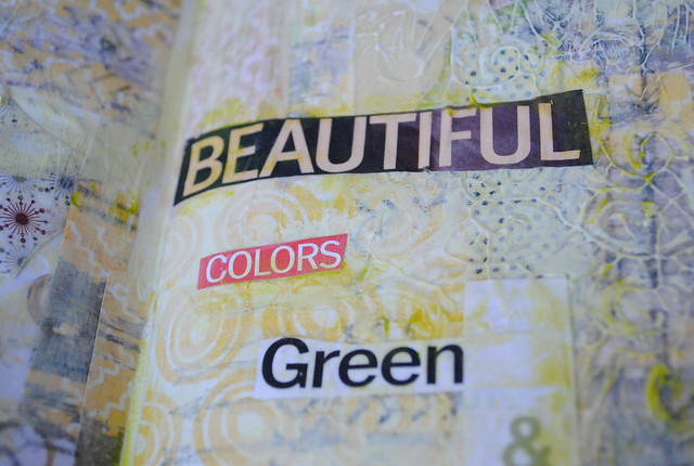
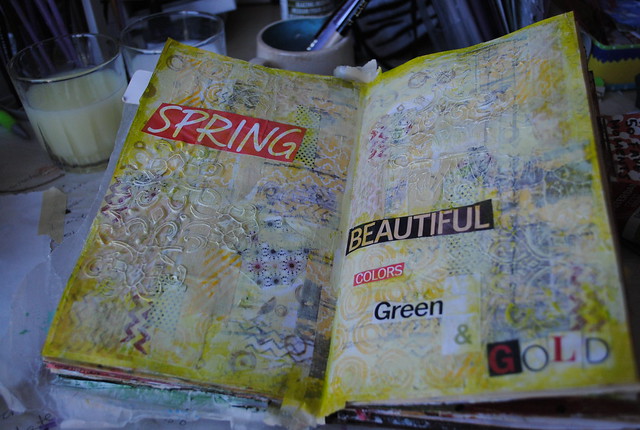
To finish the page, I knew I wanted to add words - my go-to "I don't know what to do, but I know I want to finish this page" element - so I dug through my "words" envelop (filled every time I go through a magazine and cut random things out) and selected a few words. From those words, I chose these (and made one up from individual letters to complete the make-shift poem). Perfectly fitting.
So good! Simple, but so much more if you look (and touch) deeper! LOVE!
Layers:
- journaling (regular fine-point pen)
- doodles with Neocolour II (yellow, green)
- gesso
- collage (patterned scrapbook paper, solid cardstock)
- stamps and ink (yellow, green, dark gray - arrows, chevron)
- washi tape
- gel medium and stencils
- paint: olive green light (Amsterdam acrylic) + gesso
- collage (magazine words)
- paint (same as #8)

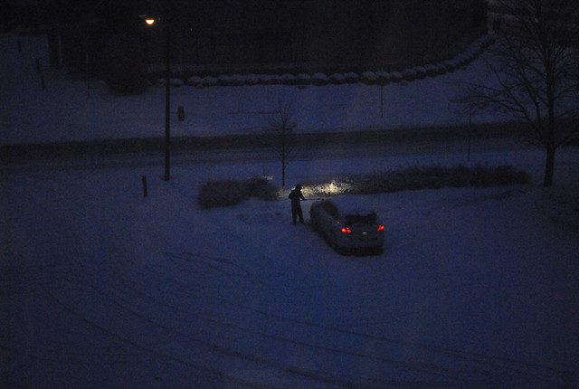 I almost missed this week - totally forgot! - so I just took a quick photo through the window. We had just had a dumping of snow, and I liked this car-cleaning scene.
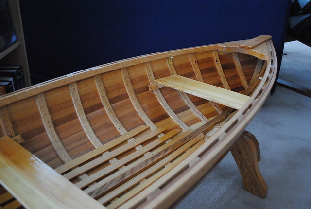 This was our big Christmas gift from my parents - still awaiting the glass cover. We don't really have a great spot for it, but I just love it so! My brothers each got one too; it was definitely the epic gift this year! Such a surprise and such a lovely, personal, addition to our homes.
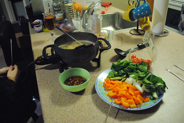 It had been so long since I used my fondue pot, I just had to pull it out the other week. I love using it to boil broth the most - you just cook the raw veggies and meat directly in it. I used homemade broth with added Thai flavours (SO good), marinated chicken and a variety of vegetables (orange pepper, asparagus, bok choy and grape tomatoes). After we were done fondue-ing, we added the leftovers and some rice noodles to the broth and had soup. SO tasty!
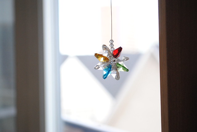 Another Christmas gift from my mom - so pretty!