Yesterday I took the bus to Curry's to pick up the gel medium that I needed. Of course, there was no way I was coming out of the shop with ONLY medium - I also snagged some paint, a brush and some black India ink. When I mentioned my haul to my friend Angie, she suggested that I post about it here, which I thought was a great idea. So here's a look at my growing collection of painting supplies:
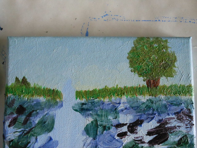
 I really love Golden products. The gesso and regular gel medium (semi-gloss) are almost finished, I use them a lot. The gesso is perfect for priming and white-washing and mixing with paint. The gel medium is perfect for mixing paint - it really helps extend the life of my pigments since it takes on the colour with barely any fading. It works great as an adhesive too. The molding paste equals texture. The giant container of matte gel medium is what I just picked up - I would have gone with semi-gloss if they'd had a bigger jar but I thought I'd try the matte for a change. I think I prefer the look of the gloss though, especially for the water I'm painting at the moment. In the middle is liquid acrylic gloss medium - I prefer the gel medium because it's easier to control, but this works well for certain things.
 This is the set of paint I started with a couple years ago. They're small tubes, but like I said, the acrylic media helps to stretch the pigments. I prefer these heavy body acrylics to the fluid ones, again, because of greater control.
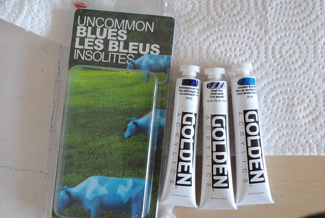 Yesterday, I picked up this trial size of uncommon blues (from left: anthraquinone blue, smalt hue and cerulean blue deep). I thought they'd be fun to try and perfect for the water I'm painting.
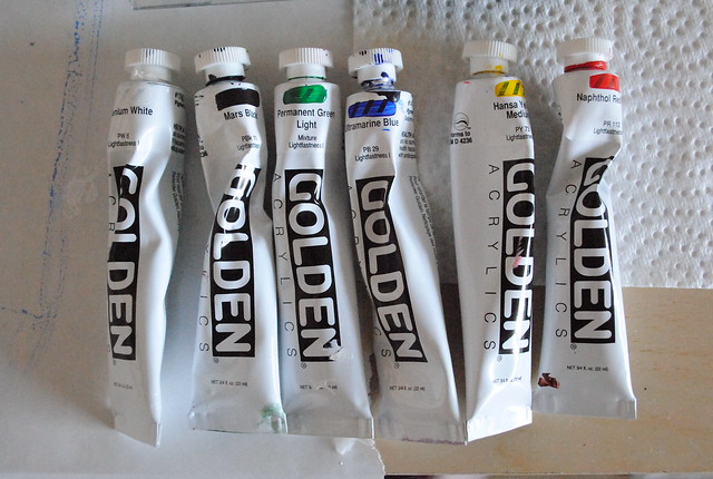
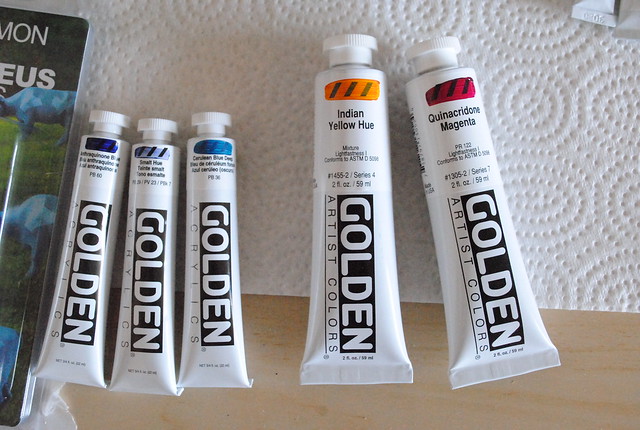 I also grabbed two larger tubes of yellow and magenta. I mix my own colours, so the basics are essential.
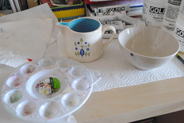 Here's what I use for mixing: a plastic "palette" tray thing from Wal-Mart and a small bowl from IKEA (for larger volumes). The creamer in my vintage dishes pattern is for water (a friend sent me this, and since I already had one, I thought it would be perfect to keep on my craft desk).
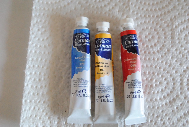 Occasionally I use watercolours - I mix my colours using these primary pigments.
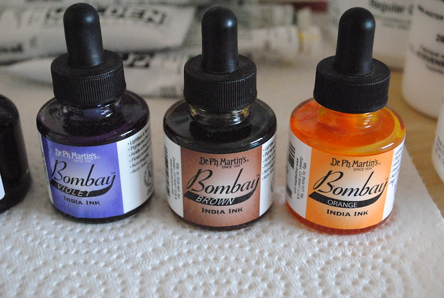
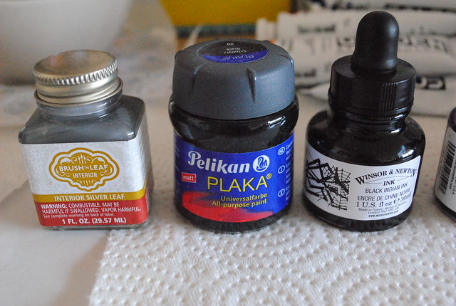 India ink in violet, brown, orange (top) and black (bottom right) - black Plaka - and some metallic silver paint - I've experimented with these mostly in my sketchbooks.

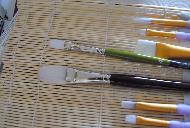 Lastly, my brushes. Nothing too fancy or expensive, but they do the job. I like the ones with the synthetic white bristles, but I haven't tried many other kinds. I have a few that dried hard by mistake, so I use those to mix. I recently fell for the filbert brushes (bottom) - the slightly rounded tip and flat shape are ideal for me.
All of these supplies (excluding the mixing bowls/palette) came from either Michael's, Curry's or Mixed Media (a small shop on James North in Hamilton) - oh, except for the bamboo brush holder and a fan-shaped brush (second from the left in the top photo), which my mom got for me in a small shop in Montreal.
What are your favourite painting supplies?