
It seems like Pantone agrees with me - tangerine tango is the top colour for spring 2012. Dusty, "natural" shades of olive, mustard, purple & tan round out brighter shades of pink, navy, teal & lilac. Other fashion sites agree - layered neutrals, pastels & muted tones with bright pops of orange, coral & green top the charts this season. Graphic black & white with bold accessories remains popular as well.
Anyway, on to the good stuff. Here are my colour palettes for spring 2012.
First, the pastels:
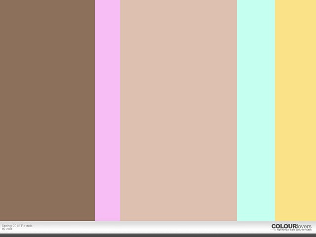 Fawn & oatmeal are my favourite neutrals & I paired them with a sassy orchid, a surprisingly versatile mint green & a soft butter yellow. If your pastels are muted, they can practically substitute for your spring neutrals. Don't feel like you need to stick to tans & browns for your darker shades either - dusty hues of grey, blue, purple & olive are all very trendy right now & look great in sheer layers.
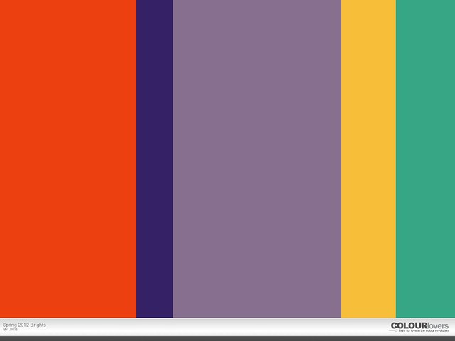 For my brighter spring palette, I went with my favourite shades of orange & purple, pairing them with a deep indigo, playful gold & seafoam green. A nice bright teal would have been great too. Use these brights to add some interest to your otherwise neutral ensemble. Don't be shy to mix one or two bright shades!
What colours are you wearing & using in your home decor this spring?
Fawn & oatmeal are my favourite neutrals & I paired them with a sassy orchid, a surprisingly versatile mint green & a soft butter yellow. If your pastels are muted, they can practically substitute for your spring neutrals. Don't feel like you need to stick to tans & browns for your darker shades either - dusty hues of grey, blue, purple & olive are all very trendy right now & look great in sheer layers.For my brighter spring palette, I went with my favourite shades of orange & purple, pairing them with a deep indigo, playful gold & seafoam green. A nice bright teal would have been great too. Use these brights to add some interest to your otherwise neutral ensemble. Don't be shy to mix one or two bright shades!What colours are you wearing & using in your home decor this spring?
No comments:
Post a Comment