
Here's a closer look at the second background I worked on for Christy Tomlinson's She Art 3 workshop.
I started with a collage using various papers (map, scrapbook, ledger, calendar, packaging, handmade and tissue papers). I originally thought I'd go more muted, so I added some white tissue paper on top to sort of tone things down.
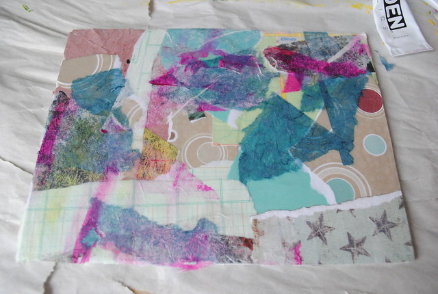
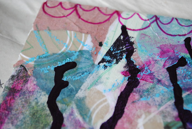
Next I added some details with Sharpies and dripped some purple India ink. I also added washi tape and rub-on letters, but I failed to capture a picture of that before moving on to the next layer.

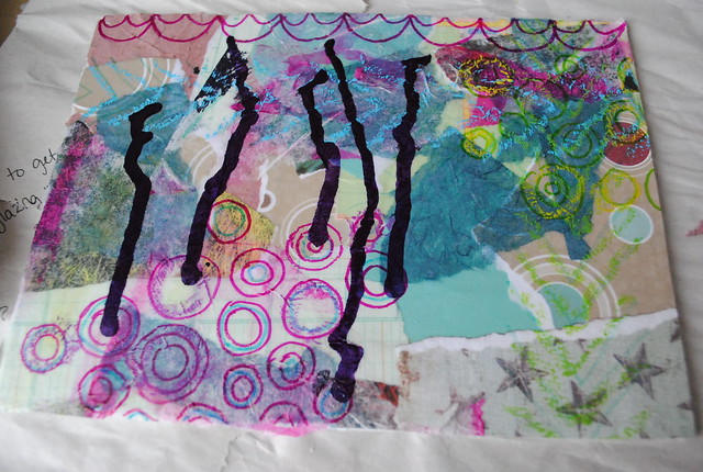
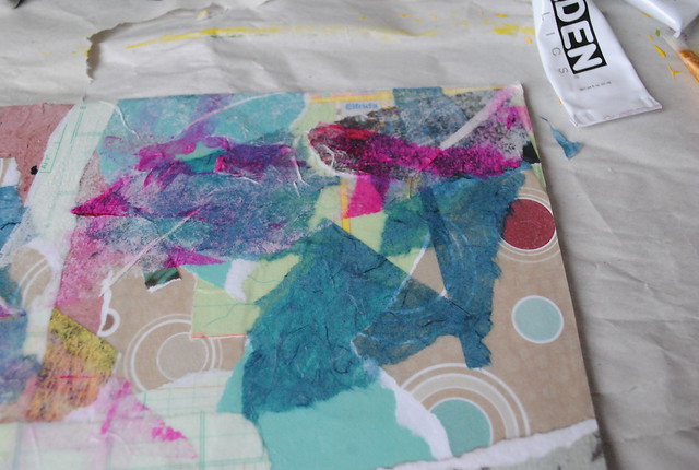
The next layer was paint. Here's my colour palette:
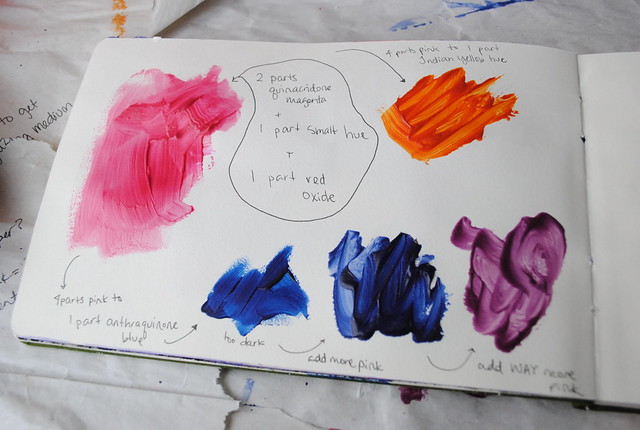 I started with the pink (2 parts quinacridone magenta, 1 part smalt hue, 1 part red oxide) then took a bit of it and added a dark blue (athraquinone blue) to get purple. The blue was entirely too dark though, so I successively added more pink until I got a very pretty purple. I wanted to try something a bit different, so I decided to go the other way with the remaining pink by adding a bit of yellow for a coral pink. I added a bit too much Indian yellow hue though and got this magnificent orange... I wasn't convinced it would be a nice addition to my canvas, but this is all about experimentation so on it went. I added a pattern of dots using a wine cork:
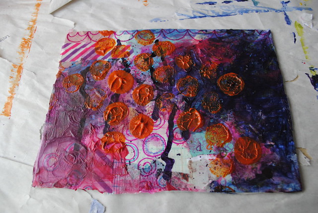
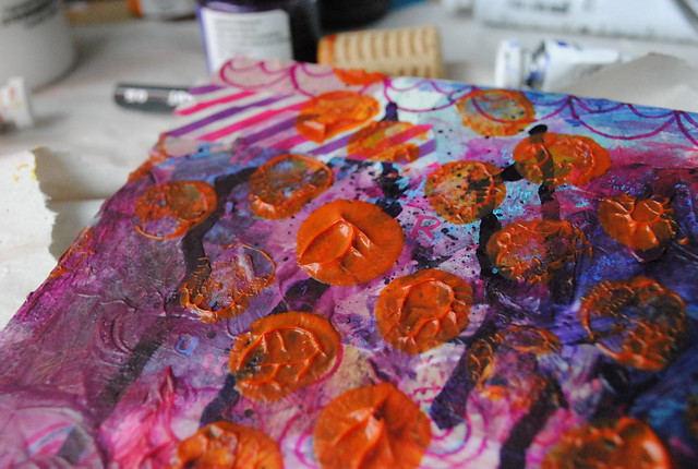
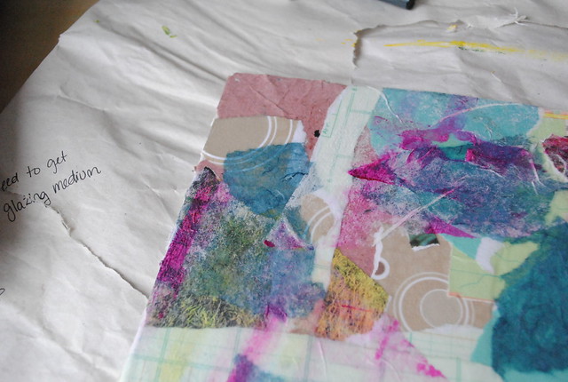
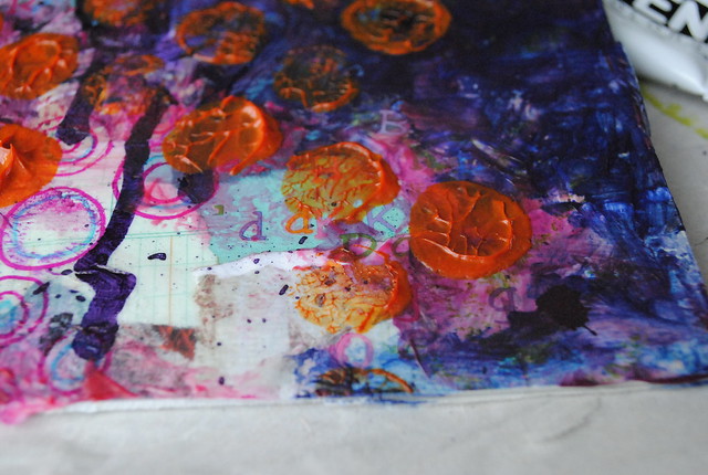 I ended up really loving the palette... until it dried a bit darker than I would have liked. There are pros and cons to working with glazes and more transparent paints. This is a con - the orange just isn't as bright on dark purple as it is on white paper. After watching a few more She Art videos, I decided the canvas lacked balance, so I added a few more collage elements before doodling some texture on top.
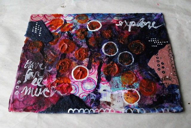
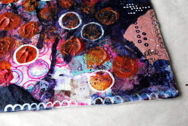
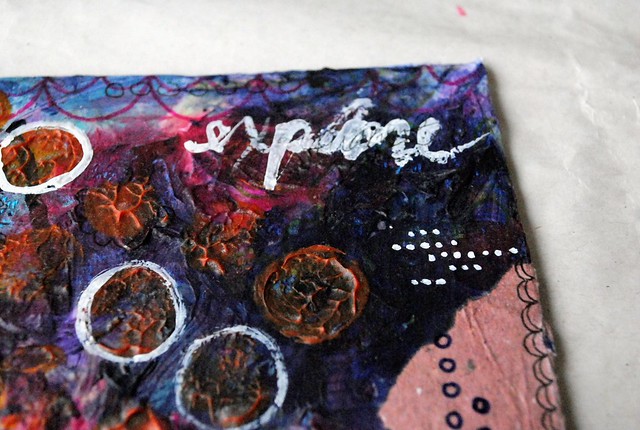 I added white and black details using paint and a fine Sharpie, respectively. Now that I have a white Sharpie, I think I'm going to add a bit more white for contrast. It's a bit dark but when I turned it so that the darker purple is at the bottom edge, portrait-style, I can almost see a girl on there. A very pale girl.
What would you do with this background to finish it?
I started with a collage using various papers (map, scrapbook, ledger, calendar, packaging, handmade and tissue papers). I originally thought I'd go more muted, so I added some white tissue paper on top to sort of tone things down.
Next I added some details with Sharpies and dripped some purple India ink. I also added washi tape and rub-on letters, but I failed to capture a picture of that before moving on to the next layer.
The next layer was paint. Here's my colour palette:
What would you do with this background to finish it?
1 comment:
It's coming along nicely! Paint drying darker is always a pain with acrylic, and even more so when you start factoring in transparencies...but once you get a feel for it, you will be able to work up so many need effects! If you really liked the orange being very bright, maybe paint over it with some white (paint thinner, and not dab, to keep your current level of texture), and then paint again with that orange. If you add a little white next time, it'll make it a little more opaque as well, and then brighter. You won't see the purple under much anymore, but you will have those beautiful, vibrant orange circles! Which, after adding more painting elements - like your girl, might balance things nicely.
Post a Comment